Loading...
Contents
How to Build a Web Dev Portfolio
That Gets You Past the 30-Second Recruiter Filter
May 12, 202642 min readUpdated Oct 5, 2026
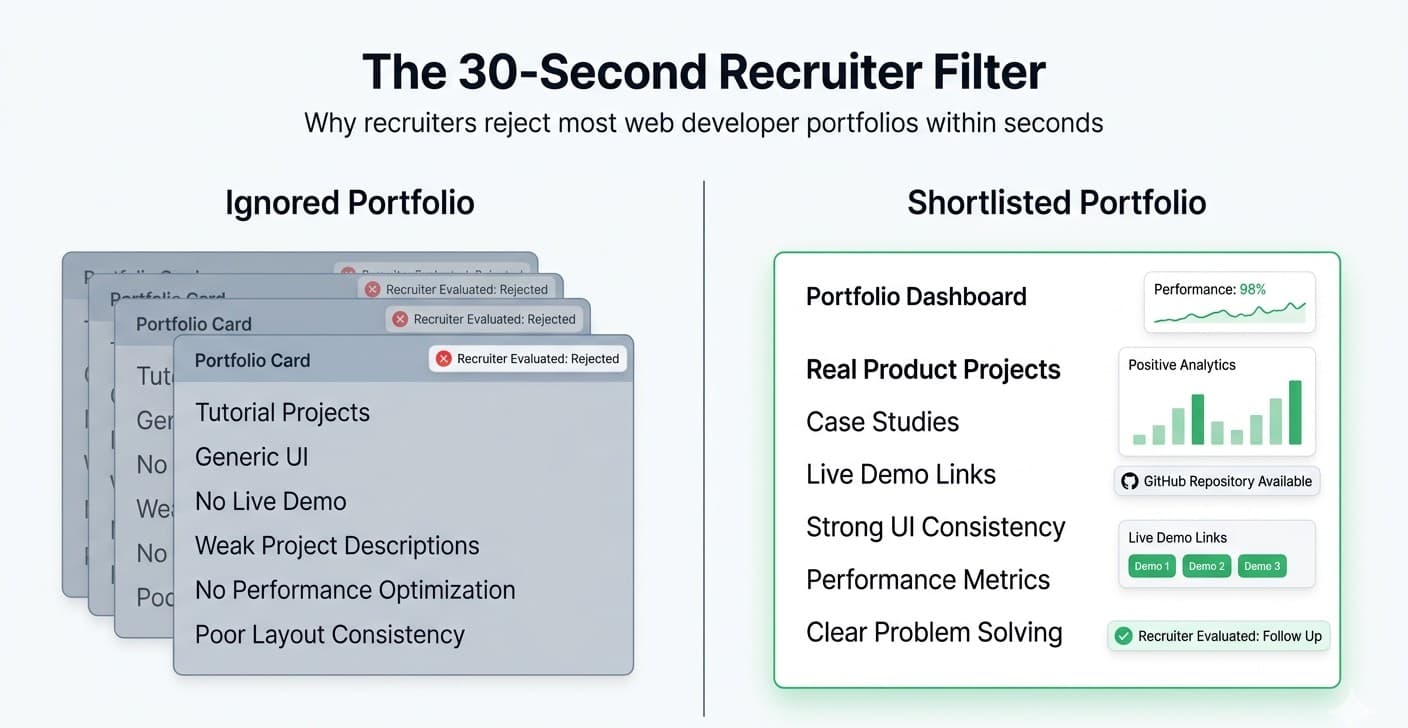
Did you know? A recruiter spends less than 30 seconds on your portfolio the first time they open it. If your portfolio doesn't grab them at that time you're rejected at the very first step. Not because you aren't talented. But because your portfolio didn't do its job fast enough. The good news? Once you understand what recruiters are actually looking for, building a portfolio that works becomes a lot less mysterious. In this blog, you will get to know how to build a web dev portfolio that doesn't just look nice, but actually gets you shortlisted, called, and hired.
FREE TO USE
25K+ INTERVIEWS4.8★ RATING68% IMPROVEMENT
Crack Your Dream Job
Real Interviews. Real Pressure. Practice until it feels easy.
- Seamless Interview Experience
- Resume & JD Questions
- Instant Personalized Feedback
Why Most Web Developer Portfolios Don't Work
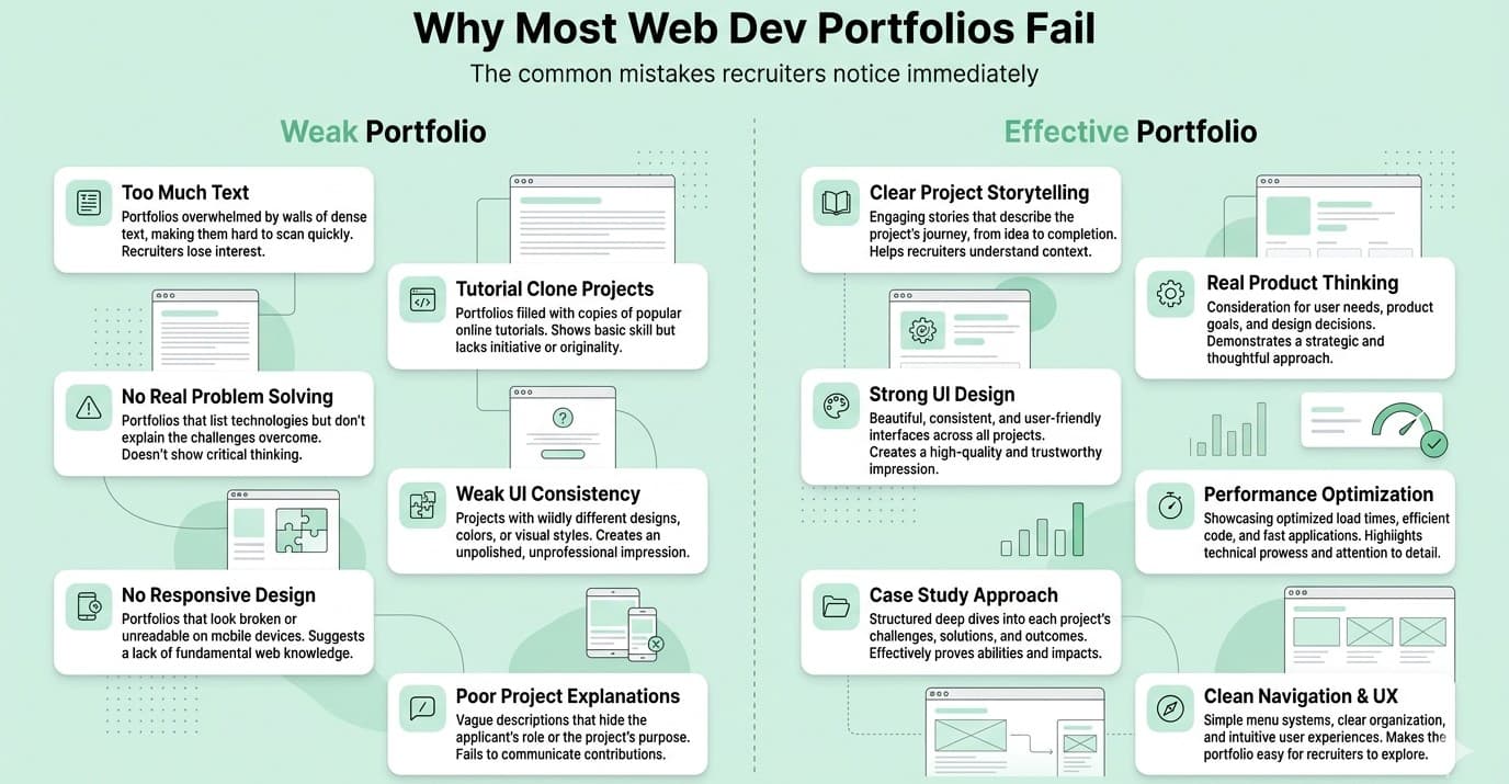
Before we get into the building, let's talk about what goes wrong. Most developers make the same mistakes: They list every project they ever built including the tutorial ones They write long paragraphs about themselves that nobody reads They use flashy animations that slow the page down They make it hard to find the contact button They put "I am a passionate developer who loves coding" in their bio (so does everyone else) Here's the truth: A recruiter doesn't want to be impressed by your animations. They want to quickly understand what you can do and whether you fit the role. Your portfolio's job is to answer 3 questions in under 30 seconds: Who are you and what do you do? Can you build real things? How do I contact you? That's it. Everything in your portfolio should serve one of these three questions.
What Recruiters Actually Look For in a Front End Developer Portfolio
This is the part most blogs skip. Recruiters and hiring managers are looking for signals, not perfection. Here are the real signals they check: Signal 1: Does this person build real projects? Not to do apps. Not a "clone of Netflix" with no backend. Real projects that solve a real problem, even a small one. Also read: Top 15 Web Development Projects for Beginners Signal 2: Is the code clean? They will click your GitHub link. If your repos have zero commits, no README, or messy variable names that's a red flag. Signal 3: Can they communicate? How you describe your projects tells them how you'll explain technical problems in team meetings. Write clearly, not in jargon. Signal 4: Does the portfolio itself look professional? Your front end web developer portfolio is your work. If it's broken on mobile or takes 5 seconds to load, you've already failed a front end test. Signal 5: Is it easy to contact you? You'd be shocked how many portfolios bury the contact section. Recruiters won't hunt for your email.
How to Build a Web Dev Portfolio - Step by Step
Before you write a single line of code, plan your structure. A portfolio that converts has these sections in this order: 1. Hero Section (Who you are + what you do) 2. About Section (Brief, human, specific) 3. Skills Section (Visual, scannable) 4. Projects Section (2–4 real projects only) 5. Experience / Education (Optional but helpful) 6. Contact Section (Easy, visible, multiple ways) Keep it simple. One page is better than five pages nobody clicks through. Open your portfolio in a new tab. Can you answer these two questions in 5 seconds? Who is this person? What can they build? If the answer is no, your hero section needs work. Bad hero section example: "Hi, I'm Ravi. I am a passionate and hardworking developer who loves solving problems." This tells a recruiter nothing specific. Good hero section example: "Hi, I'm Ravi - a Front End Developer who builds fast, accessible React apps. I've shipped products used by 20,000+ users." This is specific. It tells them your stack, your specialty, and gives social proof in one breath.# Your hero section should have: Your name Your exact role (not just "developer" - say "React Developer" or "Full Stack Web Developer") One line of proof (users, products shipped, years of experience) Two buttons: "View My Work" and "Contact Me" This is where most people go wrong. They add too many projects. Rule: Quality beats quantity. Always. Show 3 to 4 projects maximum. Each one should answer: "What problem did this solve, and how did you build it?" The 3 types of projects that impress: Type 1 — Real-World Problem Solver Something that solves an actual problem. A budgeting tool, a job tracker, a habit tracker, a local event finder. Even simple tools that work well > complex apps that are broken. Type 2 — API Integration Project Shows you can work with real data. A weather app using OpenWeather API, a GitHub profile viewer, a movie search app using TMDB, these show you can connect frontend to real backend data. Type 3 — Clone With a Twist If you built a Spotify or Twitter clone, that's fine — but add something original. A custom feature, a dark mode toggle, a speed optimization. Show your thoughts beyond the tutorial. What to include for each project: Project title + one-line description Technologies used (React, Node, MongoDB, etc.) Live link (deployed - not localhost) GitHub link 2–3 bullet points on what you built and what problem it solved A screenshot or short screen recording Never include: Todo apps (unless they have something very unique) Calculator apps Projects with no README or dead links Anything from a tutorial you didn't customize Nobody wants to read "I am a self-motivated, hardworking developer with a passion for innovation." Write like you're talking to a real person. Try this format: "I'm [Name], a front end developer based in [City]. I specialize in [React / Vue / JavaScript] and I love building interfaces that are fast, accessible, and actually fun to use. Before dev, I [one line about your background it could be anything]. That background actually helps me [connect to your work somehow]. When I'm not coding, I [one personal thing]. I'm currently looking for a [type of role] . Feel free to say hello." Keep it to 5–7 lines. Personal, specific, human. Most portfolios have a skills section that looks like this: HTML | CSS | JavaScript | React | Node | MongoDB | Git That tells a recruiter nothing about how well you know these skills. Better approach: Show skill levels with honest grouping. This is honest, specific, and shows self-awareness - which recruiters respect. Even better: Let your projects show your skills. Every project card that says "Built with React, Redux, Firebase" is worth more than listing React in a skill badge. This is the most underrated part of a portfolio. If a recruiter likes your work and can't find how to contact you in 10 seconds, they move on. Your contact section should: Be visible in the navbar (a "Hire Me" or "Contact" button) Appear again at the bottom of the page Have your email directly clickable (no hidden forms only) Link to your LinkedIn and GitHub at minimum Have a simple contact form (optional but helpful) Bonus: Add a line like "Open to full-time roles and freelance projects" so they know your availability without having to ask.Step 1: Choose the Right Structure for Your Portfolio Website for Web Developer
Step 2: Write a Hero Section That Passes the 5-Second Test
Step 3: Pick the Right Projects for Your Front End Developer Portfolio
Step 4: Write Your About Section Like a Human, Not a Robot
Step 5: Show Your Skills Without a Boring List
Step 6: Make Your Contact Section Impossible to Miss
Front End Web Developer Portfolio — Technical Requirements
Your portfolio's code speaks for you even before an interview. Here's the technical checklist your portfolio must pass: Page should load in under 3 seconds Use compressed images (WebP format) Lazy load images below the fold Score 90+ on Google PageSpeed Insights Must look good on mobile, tablet, and desktop Test on real devices, not just browser DevTools No horizontal scroll on mobile Use semantic HTML (<header>, <main>, <section>, <footer>) All images must have alt text Color contrast should pass WCAG AA standards Keyboard navigable Add a proper <title> tag: "Ravi Kumar - Front End Developer" Add a meta description Use a custom domain (not yourname.github.io if possible) Push your portfolio code to GitHub Write a proper README Use meaningful commit messages Keep your code clean - interviewers will lookPerformance
Responsiveness
Accessibility
SEO Basics
Code Quality
FREE TO USE
8k+ SESSIONS92% FLUENCY4.9★ RATING
Speak With Confidence
Real Conversations. Real Scenarios. Speak until it feels natural.
- Real-Time Speaking Practice
- Guided Conversation Flows
- Instant AI Feedback
Web Developer Portfolio Templates — Should You Use One?
This is a question a lot of people ask. Let's be honest about it. Using a template is completely fine - especially if you are just starting out. Don't let anyone make you feel bad about it. But here's the important rule: Make it yours. Customize it completely. Change the colors, layout, fonts, and content so it doesn't look like a template anymore. If a recruiter has seen your exact template 12 times this week - you blend in. Popular options for web developer portfolio templates: GitHub Pages + a free HTML template - Good for beginners, completely free Astro or Next.js from scratch - Shows you know modern tooling, best for mid-level+ Figma → Code — Design first, then code — shows design sense Framer or Webflow - Fast to build, looks great, but less "engineering signal" Best approach for front end developers: Build it from scratch using React or Next.js. Keep the design minimal. Your portfolio is your project treat it like one.
Real Portfolio Examples That Work (And Why)
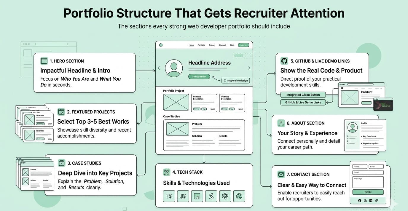
You don't need a flashy portfolio. You need a clear one. Here's what a high-converting front end developer portfolio looks like: Above the fold (what you see without scrolling): Your name + role 1-line value statement CTA buttons (View Work + Contact) Maybe a small headshot or illustration Project cards: Clean card layout, 3 projects Each has: screenshot, title, 2-line description, tech stack tags, live + GitHub links About section: Headshot 5 lines, conversational tone Current status ("Open to work") Contact footer: Email (clickable) LinkedIn, GitHub icons Simple form That's it. No music. No parallax scroll that lags on mobile. No 10-second loading animations. Simple. Fast. Clear.
Biggest Mistakes to Avoid in Your Portfolio Website for Web Developer
Here's a quick list of things that kill your chances - avoid all of these: Only PDF projects with no live links - Deploy everything. Use Vercel, Netlify, or GitHub Pages. Free forever. Grammar errors or typos - Your portfolio is a written product. Proofread. Use Grammarly. Outdated projects from 3 years ago - Keep your top 3–4 projects updated and relevant. No mobile optimization - Front end developers with broken mobile layout is an instant red flag. Missing GitHub or LinkedIn links - These are not optional. Include both. Dark background with hard-to-read text - Style is fine, but readability comes first. No custom domain - Get a domain like yourname.dev for around ₹500–700/year. It signals professionalism. Same portfolio for every type of job - Tailor your headline slightly for different roles (frontend vs full stack vs UI engineer).
The 30-Second Test — Run This on Your Portfolio Right Now
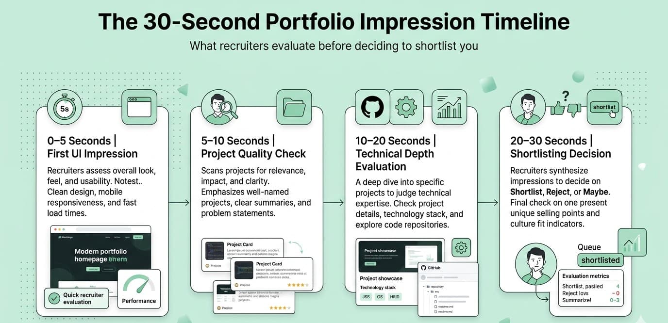
Before you share your portfolio with anyone, run this test: Open your portfolio in a new incognito window. Set a 30-second timer. Ask yourself: [ ] Can I tell what this person does in 5 seconds? [ ] Are there real projects with live links? [ ] Does the site load fast and look good on mobile? [ ] Is there a contact button easy to find? [ ] Would I call this person for an interview? If you answer "no" to any of these, fix it before sending it out.
Checklist — How to Build a Web Dev Portfolio That Works
Use this as your final checklist before launching: Content: [ ] Clear hero section with your name, role, and value statement [ ] About section (5–7 lines, human tone) [ ] Skills section (grouped by confidence level) [ ] 3–4 projects with live links + GitHub [ ] Contact section with email + LinkedIn + GitHub Technical: [ ] Loads in under 3 seconds [ ] Mobile responsive [ ] Semantic HTML used [ ] 90+ PageSpeed score [ ] Custom domain set up [ ] Portfolio code on GitHub with a good README Design: [ ] Clean, readable fonts [ ] Consistent color palette (2–3 colors max) [ ] Good contrast (text readable on all backgrounds) [ ] No broken links or missing images
Final thoughts
Here's the mindset shift that helped me most: Your portfolio is not a resume. It's a product. And like any product, it should solve a specific problem for a specific user. In this case: the problem is a recruiter trying to decide in 30 seconds if you're worth a call. Make their decision easy. Be clear. Show real work. Make contact effortless.You don't need the most beautiful portfolio on the internet. You need one that is fast, clear, and honest about what you can do. That's how you get past the filter.