Loading...
Contents
Common UI/UX Designer Interview Mistakes to Avoid in 2026
Oct 22, 202615 min readUpdated Oct 24, 2026
The most common UI/UX designer interview mistakes are showing only final screens without the thinking behind them, jumping to solutions in design challenges, not asking questions first, claiming team work as entirely your own, skipping results and metrics, getting defensive about feedback, ignoring accessibility and edge cases, and presenting case studies without a clear story. Most of these are fixable in a few weeks, and fixing them often matters more than polishing your visuals.
Most designers who miss an offer did not lose because their work was weak. They lost because of a few habits that interviewers notice within the first ten minutes. Design interviews are different from many other interviews, because your portfolio, your presentation, and your conversation are all judged at once. This guide covers the mistakes that cost designers the most, why interviewers care about each one, and what to do instead.
FREE TO USE
25K+ INTERVIEWS4.8★ RATING68% IMPROVEMENT
Crack Your Dream Job
Real Interviews. Real Pressure. Practice until it feels easy.
- Seamless Interview Experience
- Resume & JD Questions
- Instant Personalized Feedback
What Are the Most Common Mistakes in a UI/UX Design Interview?
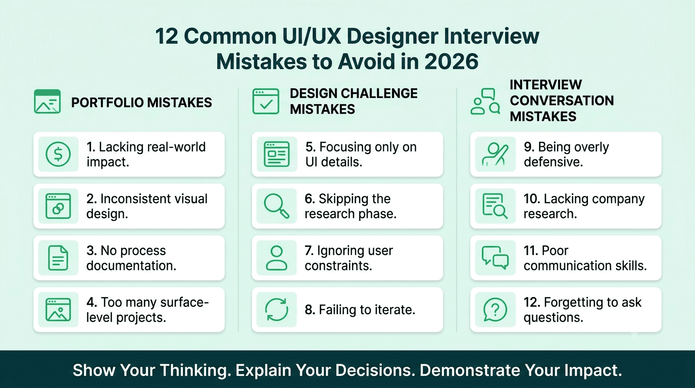
Here is the short list, grouped by where they usually happen.
In your portfolio:
Showing only polished final screens
Including too many projects
Leaving out results and impact
Not making your own role clear
In design challenges and live exercises: 5. Jumping straight to the solution 6. Not asking clarifying questions 7. Ignoring constraints, edge cases, and accessibility 8. Running out of time without a clear summary
In the conversation: 9. Getting defensive about critique 10. Not knowing the company or its product 11. Explaining decisions with taste instead of reasons 12. Under practicing spoken communication
Each one is covered below.
Why Is Showing Only Final Screens Such a Big Mistake?
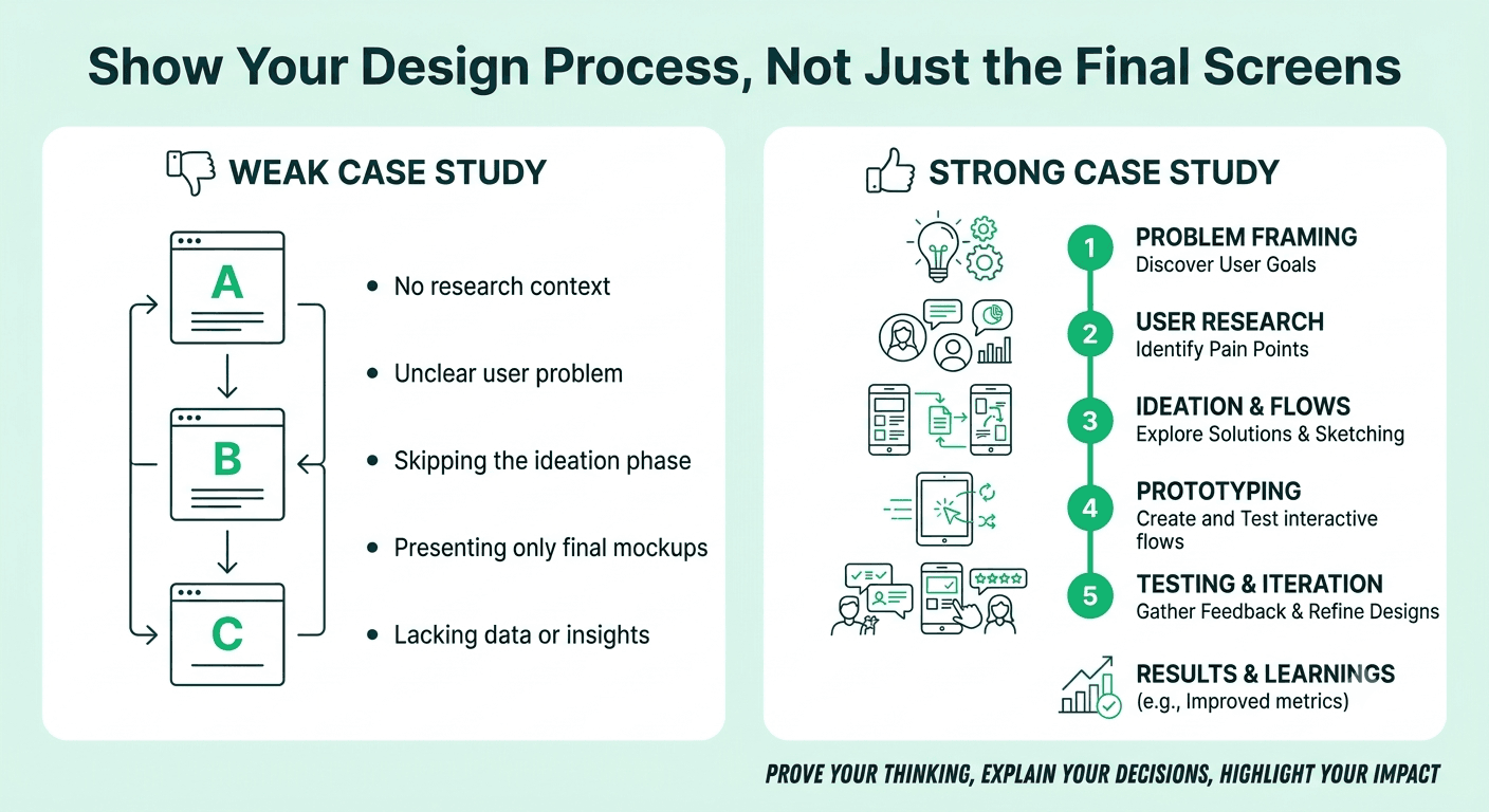
Because recruiters are not hiring your screens. They are hiring your thinking. A portfolio full of beautiful final designs with no explanation looks like a gallery, not evidence of how you solve problems.
What it looks like: a case study with a title, a few gorgeous mockups, and one sentence like "I redesigned the app to be cleaner and more modern."
What to do instead: tell the story behind the screens. Start with the problem and the goal, explain who the users were, show how you explored ideas, include a few rough sketches or rejected options, and then show the final design and what happened next. Even a short version of this makes your work far more convincing.
Do Too Many Projects Hurt Your Portfolio?
Usually, yes. Many designers think more projects means more proof. Recruiters often feel the opposite. A long list of shallow projects makes it hard to see your real strengths, and it suggests you may not have done any single project in depth.
What to do instead: choose two to four strong case studies and make each one count. Pick projects that show different skills, such as one that highlights research, one that highlights complex interaction, and one that highlights visual and system thinking. Quality of explanation beats quantity every time.
Why Do Results and Impact Matter So Much?
A design without an outcome is only an opinion. Interviewers want to know whether your work helped anyone, and hiring managers have to justify design decisions to leaders who care about results.
What it looks like: a case study that ends with the final screens and no mention of what changed afterward.
What to do instead: include whatever evidence you honestly have. This could be improved task completion in testing, fewer support questions, higher sign ups, better user feedback, or a faster development handoff. If you do not have hard numbers, share what you learned from testing or what you would measure. Never invent numbers. Interviewers often ask how a figure was measured, and an honest, smaller result is far better than a made up large one.
FREE TO USE
8k+ SESSIONS92% FLUENCY4.9★ RATING
Speak With Confidence
Real Conversations. Real Scenarios. Speak until it feels natural.
- Real-Time Speaking Practice
- Guided Conversation Flows
- Instant AI Feedback
What Goes Wrong When Your Role Is Not Clear?
Design is a team activity, so almost every project involves other people. The mistake is to present the whole project as if you did everything, or to describe it so vaguely that nobody knows what you personally did.
Interviewers will ask questions like, "What was your part in this?" If your answer is unclear, they start to doubt the rest of your portfolio.
What to do instead: state your role, the team, and the timeline at the start of every case study. Use clear sentences such as "I led the research and designed the onboarding flow, and the product manager and two engineers worked with me." Giving credit to others actually makes you look more mature, not less.
Why Is Jumping Straight to the Solution a Problem?
This is the most common mistake in live design challenges. The interviewer gives you a prompt, and you open the tool and start drawing screens within a minute.
Interviewers read this as a preview of how you work. A designer who starts designing before understanding the problem may build the wrong thing on a real team.
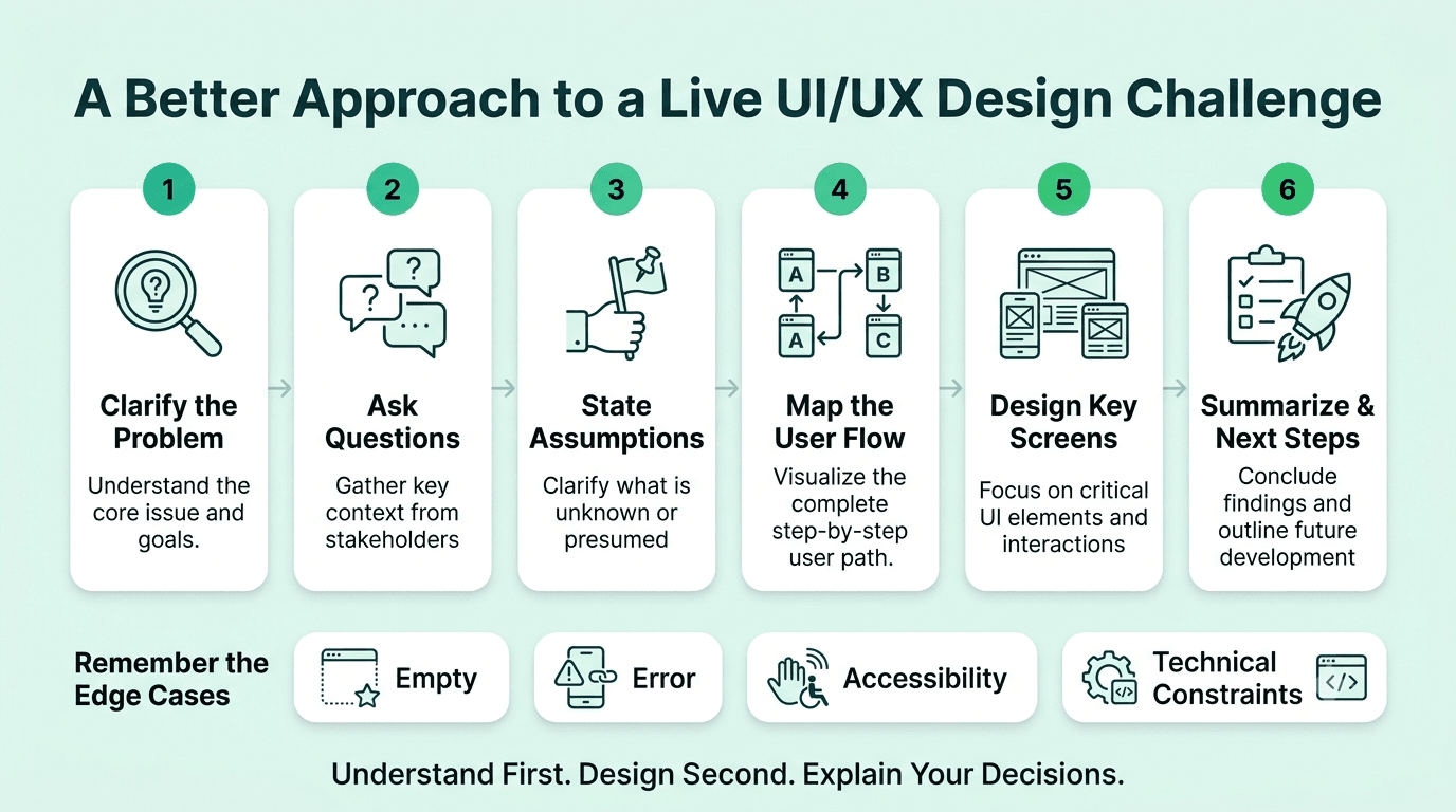
What to do instead: spend the first few minutes on understanding. Say out loud what you think the problem is, who the users might be, and what success would look like. Then describe your plan before you begin. Even in a short exercise, this structure shows maturity.
Should You Ask Questions During a Design Challenge?
Yes, always. Candidates who do not ask questions often make hidden assumptions, and interviewers can see that.
Good questions include:
Who is the main user, and what are they trying to do?
What does success look like for the business?
Are there technical or time limits I should know about?
Is this for mobile, desktop, or both?
Is there an existing design system I should follow?
If the interviewer says "assume whatever you like," then state your assumptions out loud and keep going. Saying "I will assume this is for first time users on mobile" is far better than silently choosing.
What Happens When You Ignore Constraints, Edge Cases, and Accessibility?
Designers who only think about the perfect path lose points quickly. Real products have empty states, error messages, slow connections, long names, and users with different abilities.
What it looks like: a flow that works beautifully when everything goes right and says nothing about what happens when it does not.
What to do instead: mention edge cases even if you do not draw them all. Say things like "I would also design the error state for a failed payment" or "I would check color contrast and make sure this works with a screen reader." Bringing up accessibility without being asked is one of the simplest ways to look more senior. Also mention technical feasibility and say you would talk to engineers early.
How Do You Avoid Running Out of Time in a Design Exercise?
Many candidates spend too long on one detail and finish without a clear conclusion. A half finished design with no summary leaves a weak final impression.
What to do instead: divide your time in advance. For a one hour challenge, you might spend ten minutes on understanding, ten on flows, twenty on key screens, and the rest on edge cases and a summary. If you run low on time, say what you would do next. A clear ending matters more than one extra polished screen.
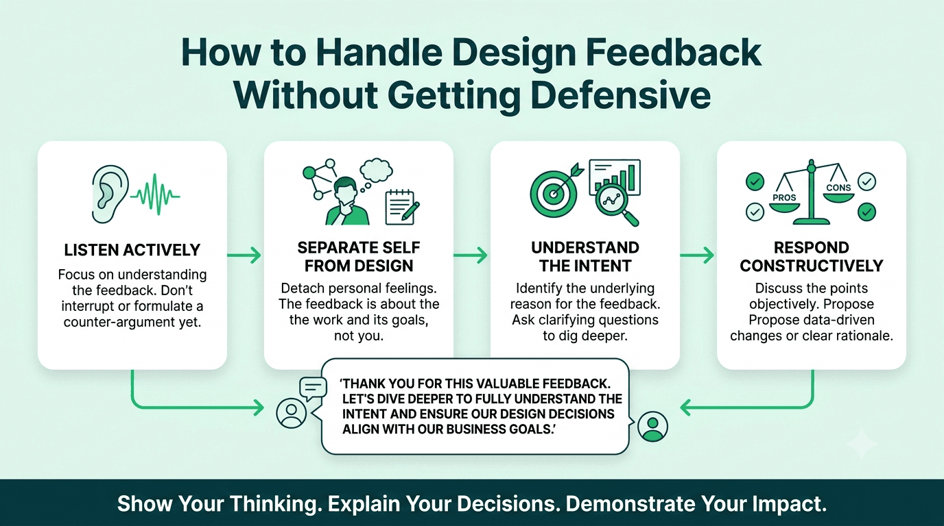
Why Is Getting Defensive About Feedback So Costly?
Because collaboration is a huge part of the job, and interviewers often test it on purpose. Many will challenge a decision in your portfolio just to see how you respond.
What it looks like: explaining why the interviewer is wrong, or treating every question as an attack.
What to do instead: stay curious. Say something like "That is a fair point, here is what I considered and what I would try next." If you genuinely agree, say so. Showing that you can take feedback calmly and improve the work is a strong positive signal.
Does Not Knowing the Company's Product Really Matter?
Yes, and it is an easy mistake to avoid. Interviewers can tell quickly when a candidate has not used the product or thought about its users.
What to do instead: before the interview, use the product like a real customer. Note two or three things that work well and one or two ideas for improvement, framed respectfully. Think about who the users are and what the business is trying to achieve. You do not need to redesign their app, but a thoughtful observation shows genuine interest.
Why Is Explaining Decisions With Taste Not Enough?
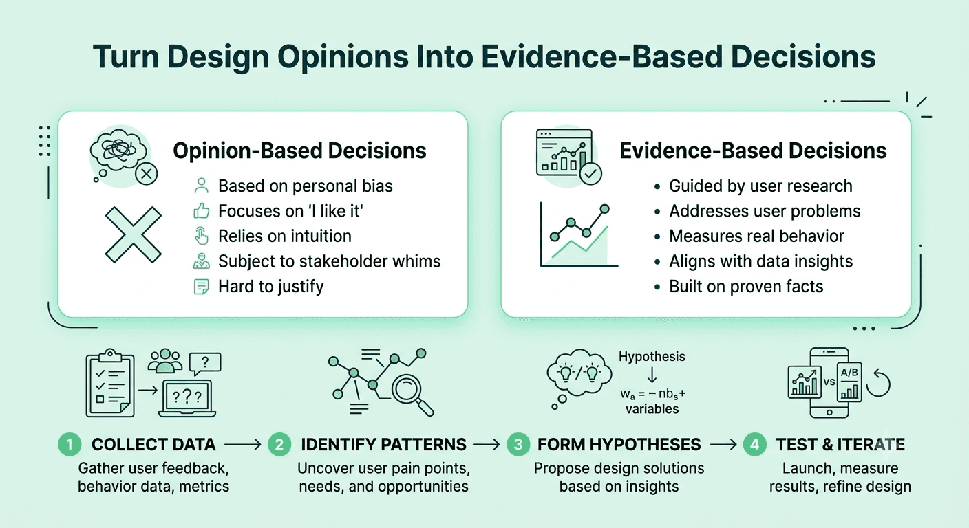
Statements like "I just felt it looked better" or "it is more modern" do not give the interviewer anything to evaluate. Design decisions need reasons that connect to users and goals.
What to do instead: link every major decision to evidence or a principle. For example, "I made the button larger and moved it lower because most users were on phones and testing showed they missed the smaller target." Even when you rely on judgment, explain what you were trying to achieve.
Why Does Poor Spoken Communication Cost So Many Offers?
Because design interviews are spoken, and many candidates practice only the visuals. You can have an excellent portfolio and still lose points if your presentation is rushed, scattered, or too long. This affects almost everyone under pressure, and it is especially common for candidates interviewing in English as a second language.
What to do instead: practice your case studies out loud, not just on screen. Time each one to about five to seven minutes. Record yourself and listen for filler words and long pauses. Run full practice interviews with realistic follow up questions on Mocklingo's AI mock interview tool, and use Mocklingo's English communication practice to build clear, calm delivery when you explain your design thinking.
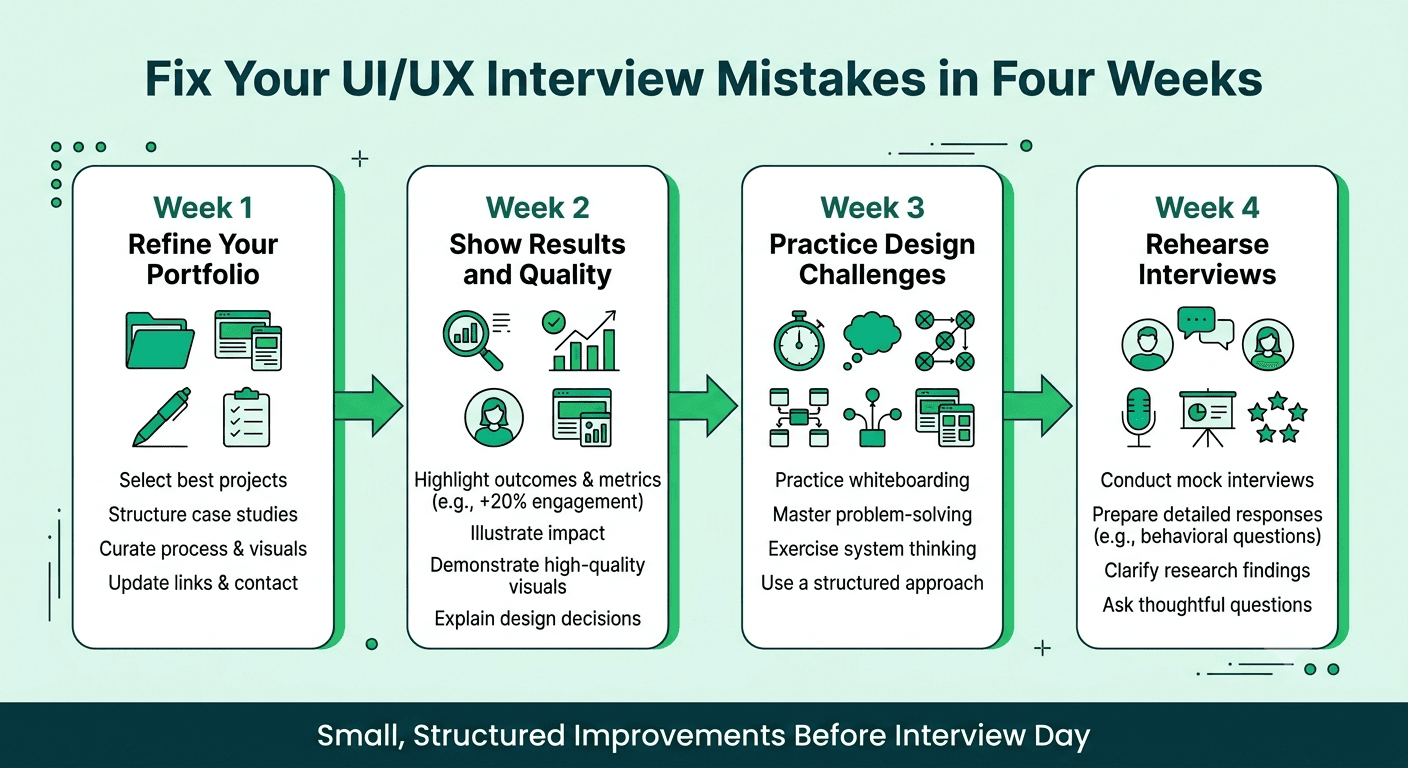
How Can You Fix These Mistakes Before Your Interview?
A simple four week plan works well.
Week one: Review your portfolio. Cut it to your best two to four case studies, and rewrite each one to start with the problem, your role, and the goal.
Week two: Add results to every project, even small ones. Add a short note on accessibility and on how you worked with developers.
Week three: Practice two or three timed design challenges. Focus on asking questions, stating assumptions, and ending with a clear summary.
Week four: Run at least two full mock interviews, present your case studies out loud, and ask someone to challenge your decisions so you can practice staying calm.
FAQs
More Blogs

Oct 22, 2026
UI/UX Designer Interview Preparation Guide: A Complete Roadmap for 2026
38 min read

