Loading...
Contents
Top 100 Data Analyst Interview Questions
Aug 5, 2026136 min readUpdated Sep 21, 2026
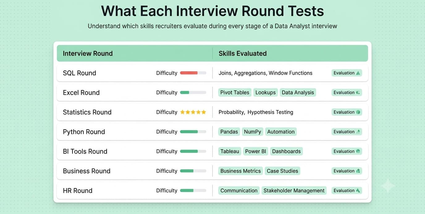
A Comprehensive Preparation Guide
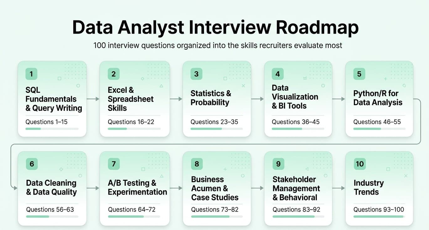
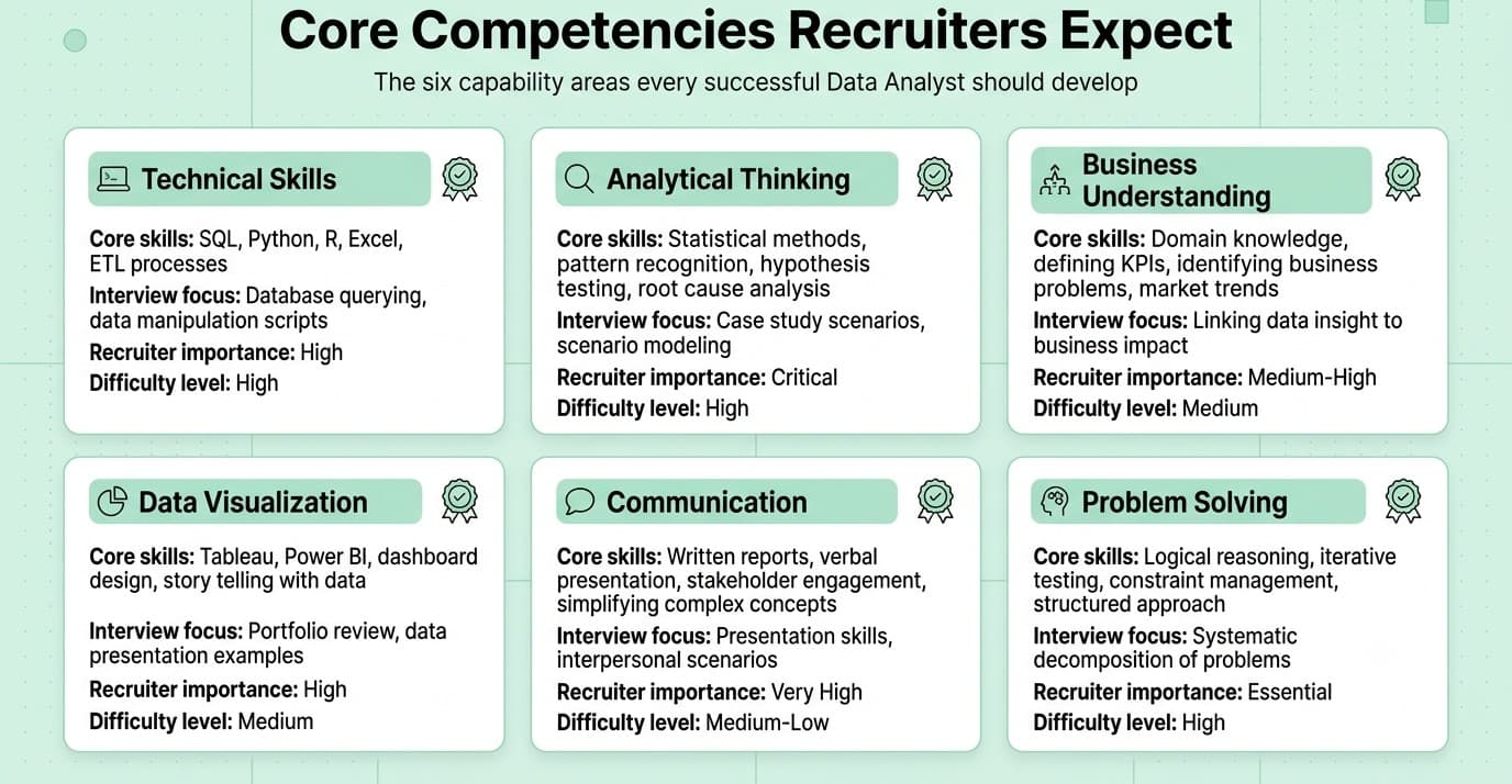
This guide covers the 100 most important data analyst interview questions, organized by topic and roughly ordered by frequency/importance within each category, moving from foundational to advanced, business-facing, and current industry trends.
Categories:
- SQL Fundamentals & Query Writing (Q1-15)
- Excel & Spreadsheet Skills (Q16-22)
- Statistics & Probability (Q23-35)
- Data Visualization & BI Tools (Q36-45)
- Python/R for Data Analysis (Q46-55)
- Data Cleaning & Data Quality (Q56-63)
- A/B Testing & Experimentation (Q64-72)
- Business Acumen & Case Studies (Q73-82)
- Stakeholder Management & Behavioral (Q83-92)
- Industry Trends (Q93-100)
Also Read: Data Analyst Interview preparation guide
FREE TO USE
25K+ INTERVIEWS4.8★ RATING68% IMPROVEMENT
Crack Your Dream Job
Real Interviews. Real Pressure. Practice until it feels easy.
- Seamless Interview Experience
- Resume & JD Questions
- Instant Personalized Feedback
Part 1: SQL Fundamentals & Query Writing
Question 1
Question: What is the difference between WHERE and HAVING clauses?
Answer: WHERE filters individual rows before any grouping/aggregation occurs and cannot reference aggregate functions. HAVING filters groups after aggregation (used with GROUP BY) and can reference aggregate functions like COUNT, SUM, or AVG.
Explanation: This tests understanding of SQL's logical query processing order (FROM → WHERE → GROUP BY → HAVING → SELECT → ORDER BY), which is a foundational concept for writing correct queries.
Real-World Example: Finding "customers who placed more than 5 orders" requires HAVING COUNT(order_id) > 5 after grouping by customer, whereas filtering "orders placed in 2025" uses WHERE on the order date before any grouping happens.
Common Mistakes: Trying to use an aggregate function in a WHERE clause (causes an error), or using HAVING to filter non-aggregated conditions that would be more efficient in WHERE (since WHERE filters before the more expensive grouping step).
Follow-up Questions: What is SQL's logical order of execution? Can you filter on both WHERE and HAVING in the same query? Why is filtering with WHERE generally more efficient than HAVING when possible?
Question 2
Question: Explain the different types of JOINs and when you'd use each.
Answer: INNER JOIN returns only matching rows between tables. LEFT JOIN returns all rows from the left table plus matches from the right (NULL where no match). RIGHT JOIN is the mirror of LEFT. FULL OUTER JOIN returns all rows from both tables, matched where possible. CROSS JOIN produces a Cartesian product of both tables.
Explanation: JOINs are among the most tested SQL concepts for analysts since almost all real analysis combines data from multiple tables.
Real-World Example: To find customers who have never placed an order, you'd LEFT JOIN customers to orders and filter for NULL order IDs — an INNER JOIN would exclude exactly the customers you're trying to find.
Common Mistakes: Defaulting to INNER JOIN without considering whether unmatched rows matter for the analysis (silently dropping relevant data), or forgetting NULL-handling implications when aggregating after an outer join.
Follow-up Questions: How would you find rows that exist in one table but not another? What happens to your row count if you join on a column with duplicate values on both sides? How would you write a self-join, and when is one useful?
Question 3
Question: What are window functions, and how do they differ from GROUP BY?
Answer: Window functions (like ROW_NUMBER, RANK, LAG, LEAD, SUM() OVER()) perform calculations across a set of rows related to the current row without collapsing the result into a single row per group, unlike GROUP BY which aggregates and reduces the number of returned rows.
Explanation: Window functions are essential for analyst-level SQL (running totals, rankings, period-over-period comparisons) and are one of the clearest signals of SQL fluency beyond basic querying.
Real-World Example: Calculating each salesperson's rank within their region while still showing every individual transaction row requires RANK() OVER (PARTITION BY region ORDER BY sales DESC) — a GROUP BY would collapse the individual transaction detail.
Common Mistakes: Confusing PARTITION BY with GROUP BY (PARTITION BY doesn't reduce row count), or not understanding the difference between RANK, DENSE_RANK, and ROW_NUMBER when handling ties.
Follow-up Questions: What's the difference between RANK, DENSE_RANK, and ROW_NUMBER? How would you calculate a 7-day rolling average using window functions? How would you find the difference between each row and the previous row (LAG)?
Question 4
Question: How would you find duplicate records in a table, and how would you remove them?
Answer: To find duplicates: GROUP BY the columns defining uniqueness and use HAVING COUNT(*) > 1. To remove them, use a window function like ROW_NUMBER() OVER (PARTITION BY duplicate_columns ORDER BY some_tiebreaker) in a CTE or subquery, then DELETE where the row number is greater than 1 (keeping only the first occurrence).
Explanation: An extremely common practical SQL exercise, testing both query-writing skill and awareness of the need for a deterministic tiebreaker when deciding which duplicate to keep.
Real-World Example: A customer table with duplicate entries from multiple data source imports might be deduplicated by partitioning on email address and keeping the most recently updated record via ORDER BY updated_at DESC.
Common Mistakes: Deleting duplicates without a clear, deterministic rule for which copy to keep (risking losing the "wrong" or more complete record), or using DISTINCT when the goal is actually identifying/removing duplicates from the underlying table rather than just deduplicating query output.
Follow-up Questions: How would you do this without a window function (older SQL versions)? How would you find duplicates based on a subset of columns rather than the whole row? How would you prevent duplicates from being inserted in the first place?
Question 5
Question: What is a CTE (Common Table Expression), and why would you use one instead of a subquery?
Answer: A CTE (defined with WITH) is a named, temporary result set that exists only for the duration of a single query, improving readability by breaking complex logic into named, sequential steps, and allowing the same result set to be referenced multiple times without rewriting it (unlike a repeated subquery).
Explanation: CTEs are heavily used in real analyst work for complex, multi-step queries — interviewers check both syntax knowledge and judgment about when they improve query maintainability.
Real-World Example: A multi-step funnel analysis (users who viewed a product, then added to cart, then purchased) is far more readable as a series of named CTEs than as deeply nested subqueries.
Common Mistakes: Assuming a CTE is always more performant than a subquery (in some databases, CTEs are optimization fences that prevent certain query optimizations — behavior varies by database engine), or overusing CTEs for trivial single-use logic where a simple subquery would be clearer.
Follow-up Questions: What is a recursive CTE, and when would you use one? How does CTE performance compare to a temp table for very large intermediate results? Can you reference one CTE inside another in the same WITH clause?
Question 6
Question: How would you calculate a running total (cumulative sum) in SQL?
Answer: Use a window function: SUM(amount) OVER (ORDER BY date ROWS BETWEEN UNBOUNDED PRECEDING AND CURRENT ROW), which sums all values from the start of the ordered set up to and including the current row.
Explanation: A very commonly requested practical query, testing fluency with window function frame clauses beyond just PARTITION BY.
Real-World Example: A cumulative revenue chart showing "total revenue to date" by day is a direct, common business application of a running total.
Common Mistakes: Forgetting to specify the ORDER BY within the OVER() clause (which changes the meaning entirely, potentially summing the whole partition rather than a running total), or not partitioning by the right grouping column (e.g., calculating a running total across all customers when it should be per-customer).
Follow-up Questions: How would you calculate a running total that resets each month? How would you calculate a moving average over a fixed window (e.g., last 7 rows) instead of a full running total? What's the default frame if you omit the ROWS BETWEEN clause?
Question 7
Question: What's the difference between UNION and UNION ALL?
Answer: UNION combines the result sets of two queries and removes duplicate rows (requiring an implicit sort/deduplication step), while UNION ALL combines them and keeps all rows, including duplicates, making it faster since it skips the deduplication step.
Explanation: A simple but frequently tested distinction, also testing whether candidates default to the more performant option (UNION ALL) when duplicates aren't a concern.
Real-World Example: Combining "orders from 2024" and "orders from 2025" tables where each order ID is inherently unique across the two source tables should use UNION ALL to avoid unnecessary performance overhead from deduplication that isn't needed.
Common Mistakes: Defaulting to UNION out of habit even when duplicates are impossible or irrelevant, unnecessarily incurring the performance cost of deduplication.
Follow-up Questions: What are the requirements for columns when using UNION (data types, column count)? How would you combine data from tables with slightly different column structures? Does UNION preserve the order of rows from the original queries?
Question 8
Question: How would you write a query to find the second-highest salary in an employee table?
Answer: Several approaches: use OFFSET/LIMIT with DISTINCT and ORDER BY DESC (SELECT DISTINCT salary FROM employees ORDER BY salary DESC OFFSET 1 LIMIT 1), or use a window function like DENSE_RANK() to correctly handle ties, or use a subquery finding the max salary less than the overall max.
Explanation: A classic SQL interview exercise testing edge-case awareness (ties, NULLs) beyond a naive first-pass solution.
Real-World Example: This pattern generalizes to any "nth highest/lowest value" business question, like finding the third-best-performing sales region or the second-most-recent transaction per customer.
Common Mistakes: Using LIMIT/OFFSET without DISTINCT (returns an incorrect result if the highest salary appears more than once), or not handling the case where fewer than two distinct salaries exist (should return NULL/empty, not error).
Follow-up Questions: How would you find the nth highest value in general? How would DENSE_RANK versus RANK change the result if there are ties for the highest salary? How would you find the second-highest salary per department?
Question 9
Question: What is the difference between a correlated subquery and a regular (non-correlated) subquery?
Answer: A non-correlated subquery executes independently once and its result is used by the outer query. A correlated subquery references a column from the outer query, meaning it conceptually re-executes once per row of the outer query, which can be significantly slower on large datasets.
Explanation: Tests deeper understanding of query execution and performance implications, not just syntax — correlated subqueries are a common source of slow analyst queries.
Real-World Example: Finding "employees who earn more than the average salary in their own department" requires a correlated subquery (referencing the outer employee's department), whereas finding "employees who earn more than the company-wide average" only needs a non-correlated subquery.
Common Mistakes: Writing a correlated subquery when a window function or JOIN would achieve the same result far more efficiently, especially on large tables.
Follow-up Questions: How would you rewrite a correlated subquery using a window function or JOIN instead, and why might that be faster? Can you give an example where a correlated subquery is genuinely necessary? How does query plan/EXPLAIN output differ between the two approaches?
Question 10
Question: How would you handle NULL values in SQL calculations and comparisons?
Answer: NULL represents "unknown," so any arithmetic or comparison involving NULL (e.g., NULL = NULL, or 5 + NULL) returns NULL, not true/false or a number — you must explicitly use IS NULL / IS NOT NULL for comparisons and functions like COALESCE or IFNULL to substitute default values in calculations.
Explanation: A subtle but critical concept — NULL-handling bugs are among the most common real-world sources of incorrect analyst results (e.g., undercounted aggregates).
Real-World Example: Calculating average order value with AVG(discount_amount) silently ignores NULL rows rather than treating them as zero, which can significantly skew the result if NULL actually means "no discount applied" (should be 0) rather than "unknown."
Common Mistakes: Using = NULL instead of IS NULL (always evaluates to NULL/false, never matches), or not considering whether COUNT(column) versus COUNT(*) gives different results due to NULLs in that specific column.
Follow-up Questions: What's the difference between COUNT(*) and COUNT(column_name)? How does NULL behave in a WHERE clause with an IN list containing NULL? How would you replace NULL values with a default in a calculated column?
Question 11
Question: What is the difference between DELETE, TRUNCATE, and DROP?
Answer: DELETE removes specific rows based on a WHERE condition (or all rows if omitted), is logged and can be rolled back within a transaction, and is slower on large tables. TRUNCATE removes all rows from a table quickly by deallocating data pages, typically cannot be selectively filtered and is harder or impossible to roll back depending on the database. DROP removes the entire table structure along with its data permanently.
Explanation: Tests careful, precise knowledge of data-modifying commands — critical since misuse of these commands has serious, sometimes irreversible consequences in production systems.
Real-World Example: Clearing a staging table before a nightly ETL reload would typically use TRUNCATE for speed, while removing specific outdated records from a production table would use a targeted DELETE with a WHERE clause.
Common Mistakes: Assuming TRUNCATE always supports a WHERE clause (it generally doesn't — it removes all rows), or not being aware that TRUNCATE resets auto-increment identity columns while DELETE typically doesn't.
Follow-up Questions: Can TRUNCATE be rolled back in a transaction — does this vary by database? What permissions differences exist between these commands? How would you safely delete a very large number of rows without locking the table for a long time?
Question 12
Question: How would you pivot data from rows into columns in SQL?
Answer: Depending on the database, use a dedicated PIVOT operator (SQL Server/Oracle), or a conditional aggregation pattern using CASE WHEN inside aggregate functions (e.g., SUM(CASE WHEN category = 'A' THEN amount END)), which works across virtually all SQL dialects.
Explanation: Pivoting is an extremely common analyst task for turning long-format data into wide, report-friendly formats — tests practical query-writing versatility across database dialects.
Real-World Example: Turning a long-format sales table (one row per product per month) into a wide report with one row per product and a column per month is a very typical dashboard/report preparation task.
Common Mistakes: Assuming PIVOT syntax is standard across all SQL databases (it's not — many analysts default to the more portable CASE WHEN pattern for this reason), or forgetting to wrap the CASE WHEN inside an aggregate function, causing incorrect results when multiple rows exist per group.
Follow-up Questions: How would you do the reverse operation (unpivot columns into rows)? How would this approach scale if you had 50 categories to pivot into columns? Would you handle this pivot in SQL or push it to a BI tool/Python instead, and why?
Question 13
Question: Explain the difference between a primary key, a foreign key, and an index — and how indexes affect query performance.
Answer: A primary key uniquely identifies rows in a table; a foreign key enforces a relationship to another table's primary/unique key. An index is a separate structure that speeds up lookups/filtering/joining on specific columns at the cost of extra storage and slightly slower writes (since indexes must be updated on every insert/update/delete).
Explanation: While more of a database-design topic, analysts are frequently expected to understand why some queries run slowly and how indexing affects their reporting queries, especially on large tables.
Real-World Example: A dashboard query filtering millions of rows by a customer_id column without an index on that column can take seconds or minutes; adding an index can reduce that to milliseconds.
Common Mistakes: Assuming indexes are "free" performance improvements without acknowledging the write-performance and storage tradeoffs, or not knowing that a WHERE clause using a function on an indexed column (e.g., YEAR(date_column)) can prevent the index from being used.
Follow-up Questions: How would you identify that a slow query is due to a missing index? What's a composite index, and how does column order matter? Why might an index exist but still not be used by the query optimizer?
Question 14
Question: How would you write a query to calculate year-over-year (YoY) or month-over-month (MoM) growth?
Answer: Use a window function like LAG() to pull the prior period's value into the same row as the current period, then calculate the percentage difference: (current_value - LAG(current_value) OVER (ORDER BY period)) / LAG(current_value) OVER (ORDER BY period).
Explanation: An extremely common real-world analyst query pattern, testing practical application of window functions to a standard business metric.
Real-World Example: A revenue dashboard showing "+12% MoM" is calculated using exactly this pattern, comparing each month's total revenue to the immediately preceding month's total.
Common Mistakes: Forgetting to handle the first period (which has no prior period to compare against, resulting in NULL — this is expected and shouldn't cause an error), or dividing by zero if a prior period's value could legitimately be zero.
Follow-up Questions: How would you handle a division-by-zero edge case if the prior period value is 0? How would you calculate growth compared to the same period in the prior year rather than the immediately preceding period? How would you present this cleanly if the data has gaps (missing months)?
Question 15
Question: How would you optimize a slow-running analytical SQL query?
Answer: Approach: review the execution plan (EXPLAIN/EXPLAIN ANALYZE) to identify full table scans or inefficient joins, ensure appropriate indexes exist on filtered/joined columns, avoid SELECT * (fetch only needed columns), filter data as early as possible in the query (push predicates down), consider pre-aggregating or materializing frequently-used intermediate results, and check whether correlated subqueries could be rewritten as joins or window functions.
Explanation: A highly practical question testing real debugging methodology, valuable since analysts routinely encounter timeouts or slow dashboards on large production datasets.
Real-World Example: A dashboard querying a raw events table with billions of rows directly is often optimized by pre-aggregating the data into a smaller daily-summary table that the dashboard queries instead, dramatically reducing query time.
Common Mistakes: Only focusing on rewriting the query's logic without checking the execution plan first to identify the actual bottleneck (which might be a missing index, not a logic issue).
Follow-up Questions: How would you identify whether a query is I/O-bound or CPU-bound? What is a materialized view, and how could it help here? How would you decide whether to optimize the SQL query itself versus restructuring the underlying data model?
Part 2: Excel & Spreadsheet Skills
Question 16
Question: What's the difference between VLOOKUP, INDEX/MATCH, and XLOOKUP?
Answer: VLOOKUP searches a value in the leftmost column of a range and returns a value from a specified column to the right, but cannot look leftward and breaks if columns are inserted/reordered. INDEX/MATCH separates the lookup and retrieval logic, allowing lookups in any direction and being more resilient to column changes. XLOOKUP (in modern Excel) combines the simplicity of VLOOKUP with the flexibility of INDEX/MATCH, adding built-in handling for "not found" results and defaulting to exact match.
Explanation: A classic, extremely common analyst screening question testing practical spreadsheet fluency, since these functions are used constantly in real reporting work.
Real-World Example: Pulling a product's price from a reference/lookup table into a sales transaction sheet, where the price table columns might later be reordered, is a good case for INDEX/MATCH or XLOOKUP over a fragile VLOOKUP.
Common Mistakes: Forgetting to set VLOOKUP's range_lookup argument to FALSE for exact match (defaults to approximate match, which can silently return wrong results), or hardcoding column numbers in INDEX/MATCH that break if columns are inserted.
Follow-up Questions: Why might you choose INDEX/MATCH over VLOOKUP even in modern Excel? How would you look up a value based on multiple criteria (e.g., two matching columns)? How does XLOOKUP handle a value that isn't found, compared to VLOOKUP?
Question 17
Question: How would you use a PivotTable to summarize a large dataset, and what are its limitations?
Answer: A PivotTable summarizes and aggregates data by dragging fields into rows, columns, values, and filters, allowing quick multi-dimensional analysis (sums, counts, averages) without writing formulas. Limitations include performance issues on very large datasets, difficulty handling complex multi-step transformations, and the need to manually refresh when source data changes.
Explanation: PivotTables remain one of the most-used analyst tools for quick exploratory analysis — interviewers check both practical skill and awareness of when a PivotTable isn't the right tool.
Real-World Example: Summarizing monthly sales by region and product category for a quick executive summary is a textbook PivotTable use case, but the same task on hundreds of millions of transaction rows would be better handled in a database or BI tool.
Common Mistakes: Not refreshing the PivotTable after the source data changes (leading to stale results), or using a PivotTable for a task requiring row-level transformation logic that would be better suited to formulas, Power Query, or a script.
Follow-up Questions: How would you create a calculated field within a PivotTable? What's the difference between a PivotTable and a PivotChart? At what data size would you move away from Excel entirely, and to what tool?
Question 18
Question: Explain how you'd use conditional formatting and data validation to improve a spreadsheet's usability.
Answer: Conditional formatting visually highlights data based on rules (e.g., highlighting values above a threshold, color scales for magnitude, or flagging duplicates), making patterns and outliers immediately visible. Data validation restricts what can be entered into a cell (dropdown lists, number ranges, date constraints), preventing input errors at the source.
Explanation: Tests practical spreadsheet design skills relevant to building reports/tools that other (often non-technical) stakeholders will use directly.
Real-World Example: A budget-tracking spreadsheet might use conditional formatting to highlight overspent categories in red, and data validation dropdowns to ensure category names are entered consistently rather than as free text prone to typos.
Common Mistakes: Overusing conditional formatting to the point of visual clutter (reducing rather than improving clarity), or not considering that data validation dropdowns should be sourced from a maintainable named range rather than hardcoded lists.
Follow-up Questions: How would you set up a dropdown list that dynamically updates based on another cell's selection (dependent dropdowns)? How would you highlight duplicate values across two different columns? How would you communicate a validation error to a user entering invalid data?
Question 19
Question: What is Power Query, and how does it improve on manual data cleaning in Excel?
Answer: Power Query is Excel's built-in ETL (Extract, Transform, Load) tool that lets you connect to various data sources, apply a repeatable sequence of transformation steps (filtering, merging, pivoting, type conversion) through a recorded, auditable step list, and refresh the entire pipeline with one click when source data updates — unlike manual formula-based cleaning, which is error-prone and hard to reproduce.
Explanation: Tests awareness of more advanced/modern Excel capabilities beyond basic formulas, increasingly expected of analysts handling recurring reporting tasks.
Real-World Example: A weekly report pulling data from multiple CSV exports, cleaning inconsistent formatting, and combining them into one table is dramatically more reliable and less time-consuming with a saved Power Query pipeline than manually repeating the same copy-paste-and-clean steps each week.
Common Mistakes: Continuing to manually re-clean recurring data imports instead of building a reusable Power Query pipeline, wasting significant time and introducing inconsistency across report cycles.
Follow-up Questions: How would you merge (join) two data sources in Power Query? How does Power Query handle changes to the source file structure? What's the difference between Power Query and Power Pivot?
Question 20
Question: How would you build a dynamic dashboard in Excel that updates automatically as new data is added?
Answer: Use Excel Tables (not static ranges) as the data source so formulas and charts automatically expand with new rows, combine with PivotTables/PivotCharts referencing the table, and use dynamic named ranges or structured references in any custom formulas so the dashboard reflects new data without manual range adjustments.
Explanation: A practical, scenario-based question testing whether a candidate builds maintainable, low-maintenance reporting tools rather than static one-off outputs.
Real-World Example: A sales dashboard built on an Excel Table source will automatically include new month's data in all connected PivotTables and charts after a simple refresh, without the analyst needing to manually extend any cell ranges.
Common Mistakes: Building charts/formulas off fixed cell ranges (e.g., A1:A100) that don't automatically expand, requiring manual updates every reporting cycle and risking stale or incomplete dashboards.
Follow-up Questions: How would you handle a dashboard that needs to pull from multiple different sheets or files? How would you add interactive filtering (slicers) to a dashboard? How would you protect the dashboard's structure while still allowing users to filter/interact with it?
Question 21
Question: What are common array formulas or dynamic array functions (like SUMPRODUCT, FILTER, UNIQUE) used for?
Answer: These functions perform calculations across arrays of values without needing helper columns: SUMPRODUCT multiplies and sums corresponding array elements (useful for conditional sums with multiple criteria), FILTER returns a dynamically-sized subset of data matching a condition, and UNIQUE extracts distinct values from a range — all "spilling" results automatically in modern Excel without manual array entry.
Explanation: Tests more advanced formula fluency beyond basic lookups, increasingly relevant as dynamic arrays have become standard in modern Excel.
Real-World Example: Extracting a dynamically updating list of unique customer names who made a purchase this month, without manually filtering, is a common real use of FILTER combined with UNIQUE.
Common Mistakes: Using older, more cumbersome array formula patterns (like legacy CSE array formulas) unnecessarily in modern Excel where dynamic array functions handle the same task more simply and readably.
Follow-up Questions: How would you use SUMPRODUCT to sum values matching two different criteria? How does the FILTER function handle a case with zero matching rows? How would you combine FILTER and SORT to get the top 5 results dynamically?
Question 22
Question: How do you ensure a spreadsheet-based report or model is accurate and free of errors before sharing it?
Answer: Approach: build in reconciliation checks (e.g., totals that cross-verify against a known independent source), use cell formatting/color-coding to distinguish inputs from formulas, test with edge cases (empty data, extreme values), have a second reviewer spot-check key figures, and avoid hardcoded values buried inside formulas that make errors hard to trace.
Explanation: A quality-assurance question testing rigor and attention to detail — critical since spreadsheet errors have caused real, sometimes very costly, business mistakes.
Real-World Example: A financial model might include a visible "check" row that should always equal zero (e.g., total allocated budget minus total available budget), immediately flagging a broken formula or logic error if it doesn't.
Common Mistakes: Only visually eyeballing final numbers for "reasonableness" without building in systematic reconciliation checks, missing errors that produce plausible-looking but incorrect results.
Follow-up Questions: Can you describe a spreadsheet error you caught before it caused a problem? How would you audit a complex inherited spreadsheet you didn't build? What's your process for version-controlling spreadsheet files as they're revised?
Part 3: Statistics & Probability
Question 23
Question: What is the difference between mean, median, and mode, and when would you prefer one over another?
Answer: The mean is the arithmetic average, sensitive to outliers/skew. The median is the middle value when sorted, robust to outliers and better for skewed distributions. The mode is the most frequent value, useful for categorical data. The choice depends on the data's distribution shape and what "typical" should represent for the audience.
Explanation: A foundational statistics question, but interviewers probe deeper into judgment about which measure best represents skewed real-world data, a very common source of misleading reporting.
Real-World Example: Household income data is typically right-skewed (a small number of very high earners pull the mean up), so median income is the standard, more representative metric used in economic reporting rather than mean income.
Common Mistakes: Defaulting to reporting the mean without checking the distribution's shape, potentially presenting a misleading "typical" value when the data is heavily skewed by outliers.
Follow-up Questions: How would you decide which measure to report to a non-technical stakeholder? What is a bimodal distribution, and how would mean/median mislead in that case? How do outliers specifically affect mean versus median calculations?
Question 24
Question: Explain the Central Limit Theorem and why it matters for data analysis.
Answer: The Central Limit Theorem states that the sampling distribution of the sample mean approaches a normal distribution as sample size increases, regardless of the underlying population's distribution shape (given a sufficiently large sample, typically n ≥ 30 as a rough guideline). This underpins the validity of many statistical tests and confidence intervals that assume normality.
Explanation: A core theoretical concept that justifies why statistical inference works even on non-normally-distributed real-world data — frequently tested to gauge statistical depth.
Real-World Example: Even if individual customer purchase amounts are heavily right-skewed, the average purchase amount calculated from repeated large samples will be approximately normally distributed, which is why analysts can apply t-tests and confidence intervals to compare average purchase amounts across groups.
Common Mistakes: Confusing the CLT (about the sampling distribution of a statistic) with a claim that the underlying data itself becomes normal (it doesn't — only the distribution of the sample mean does, as sample size grows).
Follow-up Questions: How large does a sample need to be for the CLT to reasonably apply? How does the CLT relate to why we use t-tests and z-tests? What happens to your confidence interval width as sample size increases?
Question 25
Question: What is a p-value, and what's a common misconception about interpreting it?
Answer: A p-value is the probability of observing data at least as extreme as what was observed, assuming the null hypothesis is true. A common misconception is interpreting it as "the probability the null hypothesis is true" — it is not; it only measures how surprising the observed data would be under the null hypothesis, not the probability of any hypothesis being correct.
Explanation: One of the most commonly misunderstood statistical concepts, and correctly explaining the distinction is a strong signal of genuine statistical literacy versus rote memorization.
Real-World Example: In an A/B test, a p-value of 0.03 doesn't mean "there's a 97% chance the new design is better" — it means that if the new design truly had no effect, there'd be only a 3% chance of seeing a difference this large or larger by random chance alone.
Common Mistakes: Treating statistical significance (p < 0.05) as automatically meaning practical/business significance, ignoring effect size entirely.
Follow-up Questions: What's the difference between statistical significance and practical significance? How does sample size affect p-values, even for a trivially small effect? What is a Type I versus Type II error, and how does the significance threshold relate to them?
Question 26
Question: What's the difference between correlation and causation, and how would you investigate whether a relationship is causal?
Answer: Correlation measures the strength and direction of a statistical association between two variables, but does not establish that one causes the other — a third confounding variable, reverse causation, or pure coincidence could explain the correlation. Establishing causation typically requires a controlled experiment (randomized A/B test) or, when experiments aren't feasible, quasi-experimental methods like difference-in-differences, instrumental variables, or regression discontinuity that attempt to control for confounders.
Explanation: One of the most fundamental and frequently tested concepts in data analysis, since correlation-causation confusion is a very common real-world analytical mistake with serious business consequences.
Real-World Example: Ice cream sales and drowning incidents are correlated, but neither causes the other — both are driven by a confounding variable (hot weather, leading to more swimming and more ice cream purchases).
Common Mistakes: Presenting a correlational finding with causal language ("X drives Y") in a business report without appropriate caveats, potentially leading stakeholders to make costly decisions based on an unproven causal assumption.
Follow-up Questions: Can you give a business example where you'd need to distinguish correlation from causation? What is a confounding variable, and how would you identify one? When would you use a quasi-experimental method instead of a full randomized experiment?
Question 27
Question: What is standard deviation, and how does it differ from variance?
Answer: Variance measures the average squared deviation from the mean, expressed in squared units of the original data (making it hard to interpret directly). Standard deviation is the square root of variance, returning the measure to the original data's units, making it more interpretable as a measure of spread/dispersion around the mean.
Explanation: A foundational statistics question testing basic quantitative literacy, often extended into practical interpretation questions.
Real-World Example: Two products with the same average monthly sales but very different standard deviations represent very different business risk profiles — the one with higher standard deviation has more volatile, less predictable sales.
Common Mistakes: Being able to state the formula but unable to explain what standard deviation practically represents or why it's more useful than variance for interpretation.
Follow-up Questions: What does it mean if a dataset has a standard deviation of zero? How does standard deviation relate to the normal distribution's 68-95-99.7 rule? How would you compare variability between two datasets with very different means (hint: coefficient of variation)?
Question 28
Question: Explain Type I and Type II errors in hypothesis testing.
Answer: A Type I error (false positive) occurs when you reject a true null hypothesis (concluding there's an effect when there isn't one) — its probability is the significance level, alpha. A Type II error (false negative) occurs when you fail to reject a false null hypothesis (missing a real effect) — its probability is beta, and statistical power is 1 - beta.
Explanation: Core hypothesis-testing vocabulary, frequently tested alongside real business tradeoff scenarios (e.g., in A/B testing or fraud detection) where these errors have different costs.
Real-World Example: In fraud detection, a Type I error means flagging a legitimate transaction as fraud (annoying a good customer), while a Type II error means missing actual fraud (a direct financial loss) — the acceptable balance between these depends heavily on the specific business cost of each error type.
Common Mistakes: Mixing up which error is "false positive" versus "false negative," or not being able to relate the concepts to a concrete tradeoff scenario relevant to the business context.
Follow-up Questions: How would you decide which error type is more costly to minimize in a specific business scenario? What is statistical power, and how would you increase it? How does adjusting your significance threshold (alpha) affect the tradeoff between the two error types?
Question 29
Question: What is a confidence interval, and how would you explain it to a non-technical stakeholder?
Answer: A confidence interval gives a range of plausible values for an unknown population parameter, with a specified confidence level (e.g., 95%) meaning that if you repeated the sampling process many times, about 95% of the resulting intervals would contain the true parameter value. For a stakeholder: "we estimate the true average is between X and Y, and we're fairly confident (95%) the true value falls somewhere in that range, rather than being exactly one precise number."
Explanation: Tests both statistical understanding and, importantly, the ability to translate a commonly misinterpreted concept into accurate, accessible language for a business audience.
Real-World Example: Reporting "average customer satisfaction is 4.2, with a 95% confidence interval of 4.0 to 4.4" communicates appropriate uncertainty, versus presenting 4.2 as if it were a known, exact figure.
Common Mistakes: Explaining a confidence interval as "there's a 95% probability the true value is in this specific range" (a common but technically incorrect frequentist interpretation — the true value is fixed, not random; it's the interval-generation procedure that has the 95% property across repeated sampling).
Follow-up Questions: How does sample size affect the width of a confidence interval? What's the difference between a confidence interval and a prediction interval? How would you explain why a wider confidence interval isn't necessarily "worse" than a narrow one?
Question 30
Question: When would you use a t-test versus a chi-square test versus ANOVA?
Answer: A t-test compares the means of two groups on a continuous variable. ANOVA (Analysis of Variance) extends this to compare means across three or more groups. A chi-square test examines the relationship between two categorical variables (test of independence) or compares an observed categorical distribution to an expected one (goodness of fit).
Explanation: Tests whether a candidate can match the correct statistical test to the data type and question at hand, a very practical and frequently assessed analyst skill.
Real-World Example: Comparing average order value between two website design variants uses a t-test; comparing average order value across four different marketing channels uses ANOVA; testing whether purchase likelihood is associated with customer segment (categorical) uses a chi-square test.
Common Mistakes: Running multiple pairwise t-tests instead of a single ANOVA when comparing more than two groups (inflating the false-positive rate due to multiple comparisons without correction).
Follow-up Questions: What would you do after finding a significant ANOVA result (post-hoc tests)? What assumptions does a t-test rely on, and how would you check them? How does a chi-square test handle small expected cell counts?
Question 31
Question: What is regression to the mean, and why does it matter for analysis?
Answer: Regression to the mean is the statistical tendency for extreme observations (especially those partly due to random variation) to be followed by measurements closer to the average, purely due to chance rather than any real underlying change — it's a critical concept to avoid mistakenly attributing improvement or decline to an intervention when it's actually just statistical noise settling back toward normal.
Explanation: A subtle but important concept frequently confused with genuine causal effects, especially relevant in performance evaluation and intervention analysis.
Real-World Example: A store that had an unusually bad sales month might see improved sales the following month regardless of any new intervention (like a promotion), simply because an extreme low was statistically likely to be followed by a more typical result — attributing that improvement entirely to the promotion would be a mistake.
Common Mistakes: Attributing a change following an extreme observation entirely to an intervention without considering whether some of the observed "improvement" is simply regression to the mean.
Follow-up Questions: How would you design an analysis to distinguish a real intervention effect from regression to the mean? Can you give another real-world example of this phenomenon? How does this relate to the "sophomore slump" phenomenon in sports/business?
Question 32
Question: What is the difference between a population and a sample, and why does it matter for calculations?
Answer: A population includes every member of the group being studied; a sample is a subset used to estimate population characteristics when studying the entire population is impractical. This distinction matters because sample-based variance/standard deviation calculations use Bessel's correction (dividing by n-1 instead of n) to produce an unbiased estimate of the population variance.
Explanation: A foundational concept tested to confirm the candidate understands why certain formulas differ (n vs. n-1) rather than just memorizing them.
Real-World Example: Estimating average customer satisfaction from a survey of 500 respondents (a sample) to represent all customers (the population) requires acknowledging sampling uncertainty and using appropriate sample-based formulas rather than treating the 500 respondents as the entire population.
Common Mistakes: Using the population variance formula (dividing by n) on sample data, which understates variability slightly and can lead to a false sense of precision.
Follow-up Questions: Why does dividing by n-1 (rather than n) produce an unbiased sample variance estimate? How would you determine an appropriate sample size for a given confidence level and margin of error? What's the risk of a non-representative (biased) sample even if it's reasonably large?
Question 33
Question: How would you detect and handle outliers in a dataset?
Answer: Detection methods include visual inspection (box plots, scatter plots), statistical thresholds (values beyond 1.5×IQR from the quartiles, or more than 2-3 standard deviations from the mean), and domain-specific business rules. Handling depends on the cause: investigate whether it's a data entry error (correct or remove), a legitimate rare event (may need special treatment or robust statistical methods), or meaningful signal (should be kept and possibly highlighted, not removed).
Explanation: A practical, frequently tested skill since outliers commonly distort averages and models if handled carelessly — interviewers check for thoughtful judgment, not a reflexive "just remove them" answer.
Real-World Example: A single transaction of $1 million in a dataset of typical $50-500 purchases might be a legitimate large B2B order (should be kept, perhaps analyzed separately) or a data entry error with an extra zero (should be corrected) — the right response depends entirely on investigation, not a blanket removal rule.
Common Mistakes: Automatically deleting all statistical outliers without investigating their underlying cause, potentially removing legitimate and important data points (like genuinely high-value customers).
Follow-up Questions: How would you handle outliers differently for a regression model versus a simple reporting average? What's the interquartile range (IQR) method, and how does it compare to a standard-deviation-based method? How would you communicate the impact of outliers to a stakeholder reviewing a report?
Question 34
Question: What is the difference between descriptive and inferential statistics?
Answer: Descriptive statistics summarize and describe the characteristics of a specific dataset (mean, median, charts) without generalizing beyond it. Inferential statistics use sample data to make generalizations, predictions, or test hypotheses about a broader population, incorporating uncertainty through confidence intervals and significance tests.
Explanation: A foundational distinction that frames when a candidate should (and shouldn't) generalize findings beyond the immediate dataset.
Real-World Example: Reporting "our sample of 200 surveyed customers rated satisfaction at an average of 4.2" is descriptive; concluding "we're 95% confident the true average satisfaction across all customers is between 4.0 and 4.4" is inferential.
Common Mistakes: Presenting a descriptive finding from a small, potentially non-representative sample as if it definitively generalizes to the entire population without appropriate inferential caveats.
Follow-up Questions: When would you rely purely on descriptive statistics without needing inferential methods? How does sample representativeness affect the validity of inferential conclusions? Can you give an example where descriptive statistics alone would be misleading?
Question 35
Question: How would you explain statistical significance versus practical/business significance to a stakeholder pushing to launch a feature based on a "significant" test result?
Answer: Explain that statistical significance only tells you the observed effect is unlikely to be due to random chance, but says nothing about whether the effect is large enough to matter for the business — a tiny, statistically significant improvement (e.g., 0.01% conversion lift) might not be worth the cost/risk of shipping, while a practically meaningful effect might not reach traditional significance thresholds with a small sample.
Explanation: A scenario-based question testing the ability to push back constructively on stakeholder misinterpretation of statistics, a very common and important real-world analyst responsibility.
Real-World Example: An A/B test with millions of users might find a statistically significant 0.05% conversion rate lift for a new feature — technically "significant" but likely too small to justify the engineering cost and maintenance burden of shipping it.
Common Mistakes: Simply reporting the p-value and declaring "success" without contextualizing the effect size against real business costs and benefits, missing the opportunity to guide a more informed decision.
Follow-up Questions: How would you determine the minimum effect size that would actually be worth acting on before running a test? How would you present this nuance in a way that doesn't undermine stakeholder trust in the testing process generally? What would you do if a stakeholder disagreed with your recommendation not to launch?
Part 4: Data Visualization & BI Tools
Question 36
Question: How do you decide which chart type to use for a given dataset or question?
Answer: The choice depends on what you're trying to show: trends over time use line charts; comparisons across categories use bar charts; part-to-whole relationships use stacked bars or (sparingly) pie charts; relationships between two continuous variables use scatter plots; and distributions use histograms or box plots. The guiding principle is matching the chart to the specific analytical question, not personal preference or visual appeal alone.
Explanation: A foundational visualization question testing whether a candidate thinks about communication effectiveness rather than defaulting to familiar or visually appealing but sometimes inappropriate chart types.
Real-World Example: Showing monthly revenue trends over two years is clearly a line chart use case, while a pie chart with 15 thin slices for market share by tiny competitor would be far less readable than a sorted horizontal bar chart.
Common Mistakes: Overusing pie charts for data with many categories or similar-sized slices (very hard to compare visually), or using a line chart for categorical/non-sequential data where a bar chart would be clearer.
Follow-up Questions: When, if ever, is a pie chart the right choice? How would you visualize a dataset with both a trend over time and a category breakdown simultaneously? What's your view on 3D charts and dual-axis charts?
Question 37
Question: What is the difference between Tableau/Power BI and Excel for building reports, and when would you choose one over the other?
Answer: BI tools like Tableau and Power BI are purpose-built for interactive, scalable dashboards connecting directly to live databases with better performance on large datasets, built-in interactivity (filters, drill-downs), and easier sharing/governance across an organization. Excel remains valuable for ad hoc analysis, smaller datasets, flexible calculations, and situations where stakeholders specifically need to manipulate the underlying data themselves.
Explanation: Tests practical tool judgment — a common interviewer concern is whether a candidate defaults to their most familiar tool regardless of fit, versus choosing appropriately for the situation.
Real-World Example: A live executive dashboard tracking real-time KPIs across the company is far better suited to Power BI or Tableau (connected directly to the data warehouse, auto-refreshing) than a manually updated Excel file that quickly becomes stale.
Common Mistakes: Defaulting entirely to one tool out of comfort/familiarity without considering data volume, refresh needs, or audience interactivity requirements.
Follow-up Questions: How would you decide whether a report should be a static export or a live interactive dashboard? What are the tradeoffs of connecting a BI tool live to a production database versus a dedicated reporting data warehouse? How do you handle row-level security/permissions in a shared dashboard?
Question 38
Question: What makes a dashboard effective versus cluttered or confusing?
Answer: An effective dashboard focuses on a small number of key metrics relevant to its specific audience and decision-making needs, uses a clear visual hierarchy (most important information most prominent), consistent formatting/colors, minimal unnecessary chart junk, and provides appropriate context (comparisons, targets, trends) rather than just raw numbers in isolation.
Explanation: A design-judgment question testing whether the candidate thinks about the end user's needs and cognitive load, not just technical dashboard-building capability.
Real-World Example: An executive dashboard with 30 different charts crammed onto one screen is far less useful than a focused view of 5-6 key metrics with the ability to drill down into details on demand — the latter respects the audience's limited time and attention.
Common Mistakes: Including every possible metric "just in case" rather than curating to what the specific audience actually needs to make decisions, resulting in a cluttered, hard-to-scan dashboard.
Follow-up Questions: How would you gather requirements from a stakeholder before building a dashboard? How do you decide what counts as a "vanity metric" versus an actionable one? How would you test whether a dashboard is actually being used and useful after launch?
Question 39
Question: How would you present a finding that contradicts what leadership expects or wants to hear?
Answer: Lead with the data and methodology clearly and objectively (avoiding editorializing language), anticipate likely objections and address them proactively with supporting evidence, frame the finding constructively around what action it suggests rather than just the negative result itself, and remain open to genuine follow-up questions about methodology without becoming defensive.
Explanation: A scenario-based question testing communication skill and integrity — a critical trait since analysts sometimes face pressure (implicit or explicit) to shape findings to match a desired narrative.
Real-World Example: If data shows a leadership-championed initiative isn't delivering expected results, presenting the finding alongside a clear methodology, addressing likely pushback (e.g., "could this be seasonality?" preemptively answered with a comparison), and proposing next steps demonstrates rigor rather than confrontation.
Common Mistakes: Softening or omitting an inconvenient finding to avoid conflict, undermining the fundamental value and trustworthiness of the analyst role.
Follow-up Questions: Can you describe a real time you had to deliver a finding stakeholders didn't want to hear? How do you maintain credibility when your finding is later challenged? What would you do if you were explicitly asked to "find data that supports" a predetermined conclusion?
Question 40
Question: What is data storytelling, and how does it differ from just presenting numbers?
Answer: Data storytelling structures an analysis around a clear narrative arc (context, insight, and recommended action) tailored to the audience, using visuals and language that guide the viewer to the "so what" rather than simply presenting raw charts and numbers and leaving interpretation entirely to the audience.
Explanation: Tests communication maturity — a very common differentiator between junior and senior analysts, since technical correctness alone doesn't guarantee stakeholders act on an analysis.
Real-World Example: Instead of showing a chart of declining engagement with no further context, a data storytelling approach would frame it as "engagement dropped 15% after the pricing change in March, concentrated among new users — suggesting the change may be a barrier to first-time adoption" paired with a clear recommended next step.
Common Mistakes: Presenting a wall of charts without a clear narrative thread or explicit recommendation, leaving stakeholders unsure what to actually do with the information.
Follow-up Questions: How would you structure a 5-minute presentation of a complex analysis to an executive audience? How do you balance nuance/caveats with the need for a clear, actionable narrative? Can you describe a time your data story changed a stakeholder's decision?
Question 41
Question: How would you design a KPI or metrics framework for a new product or business function?
Answer: Start by clarifying the business objective the metrics should serve, then identify a small set of primary (north star-type) metrics directly tied to that objective, supporting/diagnostic metrics that help explain movement in the primary metric, and guardrail metrics to catch unintended negative side effects — avoiding an overwhelming, unfocused list of "everything we could possibly measure."
Explanation: Tests strategic, business-oriented thinking beyond pure technical query-writing — an important skill for analysts expected to shape how success is measured, not just report numbers after the fact.
Real-World Example: For a subscription product, a primary metric might be net revenue retention, supporting metrics might include activation rate and churn rate by cohort, and a guardrail metric might be customer support ticket volume (to catch a scenario where aggressive upselling boosts revenue short-term but damages satisfaction).
Common Mistakes: Proposing an unfocused laundry list of every measurable metric without clear prioritization or connection to the actual business objective, making the framework hard to act on.
Follow-up Questions: How would you choose a single "north star" metric if leadership wanted just one? How would you detect if a metric is being gamed or optimized in an unintended way? How often would you revisit and potentially revise this metrics framework?
Question 42
Question: What's the difference between a data warehouse, a data mart, and a data lake?
Answer: A data warehouse is a centralized, structured repository optimized for business intelligence and reporting, typically containing cleaned, modeled, and integrated data from multiple sources. A data mart is a smaller, focused subset of a warehouse tailored to a specific department or use case. A data lake stores raw, often unstructured or semi-structured data at scale, offering flexibility but requiring more processing before it's report-ready.
Explanation: Tests understanding of the broader data infrastructure an analyst typically works within, relevant for roles where analysts collaborate with data engineering.
Real-World Example: A company might store raw clickstream event logs in a data lake, transform and model a subset of that data into a structured data warehouse for company-wide reporting, and further narrow that into a marketing-specific data mart for the marketing team's dashboards.
Common Mistakes: Using these terms interchangeably without understanding the meaningful structural and use-case differences between them.
Follow-up Questions: Where does a modern "lakehouse" architecture fit into this picture? How would you decide whether to query the data lake directly versus waiting for data to be modeled into the warehouse? What role does an analyst typically play in defining the data warehouse's schema/models?
Question 43
Question: How would you handle a situation where two different reports/dashboards show conflicting numbers for the same metric?
Answer: Investigate systematically: compare the underlying query/data source definitions for the metric (are they pulling from the same table, using the same filters and date ranges, and the same definition of the metric itself?), check for differences in timing/refresh schedules, and once identified, document the root cause clearly and establish a single source of truth going forward (ideally a shared, governed metric definition).
Explanation: An extremely common real-world scenario (metric definition drift) that tests systematic troubleshooting skill and awareness of the organizational risk of inconsistent reporting.
Real-World Example: Two dashboards showing different "active users" numbers might differ because one defines "active" as any login in the last 30 days while the other requires a specific in-app action — a definitional mismatch, not a data error, that erodes stakeholder trust in reporting once discovered.
Common Mistakes: Assuming the discrepancy must be a data pipeline bug without first checking simpler explanations like differing metric definitions, date ranges, or filters.
Follow-up Questions: How would you prevent this kind of discrepancy from recurring across the organization? What is a "single source of truth" or semantic layer, and how does it help? How would you communicate this finding to stakeholders who had been using the "wrong" number?
Question 44
Question: How would you visualize and communicate uncertainty or a range of possible outcomes (e.g., a forecast) rather than a single point estimate?
Answer: Use visual techniques like shaded confidence bands around a forecast line, explicitly labeled best-case/worst-case scenario ranges, or error bars on point estimates — and pair the visual with clear language emphasizing the estimate as a range or probability rather than a guaranteed single number.
Explanation: Tests communication sophistication around a commonly mishandled aspect of forecasting and estimation — stakeholders often want (and analysts often default to presenting) a single confident number, which can be misleading.
Real-World Example: A revenue forecast presented as a single line ("$5.2M next quarter") can create false confidence; presenting it as a shaded range ("$4.8M-$5.6M, most likely around $5.2M") sets more accurate expectations for planning purposes.
Common Mistakes: Presenting only a single point estimate for a forecast without conveying the underlying uncertainty, which can lead stakeholders to over-commit to plans based on false precision.
Follow-up Questions: How would you explain to a stakeholder why you can't give a single precise number for a forecast? How do you decide how wide a confidence/uncertainty range to show without it seeming unhelpfully vague? How would you validate a forecast's accuracy after the fact?
Question 45
Question: What are best practices for choosing colors and formatting in a professional data visualization?
Answer: Use color purposefully and sparingly (to highlight, not decorate) — for example, a single accent color for the key data point of interest against neutral grays for context; ensure sufficient contrast and colorblind-friendly palettes; maintain consistency across related charts; avoid default software colors that don't align with any specific meaning; and remove unnecessary gridlines, borders, and 3D effects that add visual noise without adding information.
Explanation: Tests attention to detail and design sensibility, which meaningfully affects how well an analysis is received and understood, especially by non-technical or executive audiences.
Real-World Example: A bar chart highlighting only the underperforming region in red/orange against all other regions in neutral gray immediately draws the viewer's eye to the key insight, rather than a rainbow of arbitrary colors for every bar that conveys no additional meaning.
Common Mistakes: Using default chart colors/styles without deliberate thought, or using color combinations that are difficult for colorblind viewers to distinguish (particularly common red-green combinations).
Follow-up Questions: How would you adapt a chart's design for a colorblind-accessible palette? How do you decide when a chart needs a legend versus direct labeling? What's your view on using company brand colors in data visualizations versus a more neutral analytical palette?
FREE TO USE
8k+ SESSIONS92% FLUENCY4.9★ RATING
Speak With Confidence
Real Conversations. Real Scenarios. Speak until it feels natural.
- Real-Time Speaking Practice
- Guided Conversation Flows
- Instant AI Feedback
Part 5: Python/R for Data Analysis
Question 46
Question: What is the difference between a pandas Series and a DataFrame?
Answer: A Series is a one-dimensional labeled array (essentially a single column with an index), while a DataFrame is a two-dimensional labeled data structure (rows and columns, like a table), conceptually made up of multiple Series sharing a common index.
Explanation: A foundational pandas question testing basic familiarity with Python's most common data analysis library structures.
Real-World Example: Selecting a single column from a DataFrame (df['revenue']) returns a Series, while selecting multiple columns (df[['revenue', 'cost']]) returns a DataFrame — this distinction affects which methods and operations are available.
Common Mistakes: Confusing single-bracket versus double-bracket column selection syntax and being surprised by the resulting type (Series vs. DataFrame) and its effect on subsequent operations.
Follow-up Questions: How would you convert a Series back into a DataFrame? What's the difference between .loc and .iloc for indexing? How does a pandas Index work, and why does it matter for joins/merges?
Question 47
Question: How would you handle missing data in a pandas DataFrame?
Answer: Options include: dropping rows/columns with missing values (dropna(), appropriate when missingness is rare and random), imputing with a statistic like mean/median/mode (fillna()), forward/backward filling for time series data, or using a more sophisticated model-based imputation method — the right choice depends on why the data is missing and how much of it is missing.
Explanation: A very commonly asked practical question since real-world datasets almost always have missing data, and the handling approach significantly affects analysis validity.
Real-World Example: A survey dataset with a small percentage of missing "age" responses might reasonably be imputed with the median age, while a column that's 80% missing might be better dropped entirely or flagged as an indicator of missingness itself rather than imputed.
Common Mistakes: Reflexively dropping all rows with any missing values without considering how much data (and what potential bias) that removes, or imputing without first understanding whether the data is missing at random versus systematically.
Follow-up Questions: What's the difference between data missing completely at random, missing at random, and missing not at random? How would you decide between mean imputation and a more sophisticated method? How would you flag imputed values so downstream analysis can account for the added uncertainty?
Question 48
Question: How would you merge/join two DataFrames in pandas, and what parameters matter most?
Answer: Use pd.merge(df1, df2, on='key_column', how='inner'/'left'/'right'/'outer'), where the how parameter controls join behavior just like SQL joins, and on (or left_on/right_on for differently-named key columns) specifies the join key. Key considerations include checking for duplicate keys on either side (which can unexpectedly multiply row counts) and verifying the resulting row count matches expectations.
Explanation: Tests practical pandas fluency directly analogous to SQL JOIN concepts, frequently used in real data preparation workflows.
Real-World Example: Merging a transactions DataFrame with a customer details DataFrame on customer_id using a left join ensures every transaction is retained even if some customer details are missing, mirroring a SQL LEFT JOIN.
Common Mistakes: Not checking for duplicate keys before merging, which can silently multiply rows (a many-to-many merge) and inflate downstream aggregate calculations without an obvious error being raised.
Follow-up Questions: How would you detect if a merge unexpectedly changed your row count? How does pd.merge differ from pd.concat, and when would you use each? How would you perform a merge using multiple columns as the join key?
Question 49
Question: How would you use groupby() in pandas to summarize data, and how does it relate to SQL's GROUP BY?
Answer: df.groupby('column').agg({'other_column': 'sum'}) groups rows by one or more columns and applies an aggregation function to other columns, directly analogous to SQL's GROUP BY combined with aggregate functions — pandas additionally supports applying multiple different aggregations at once and custom aggregation functions.
Explanation: A core pandas skill directly transferable from SQL knowledge, frequently tested to assess whether Python skills are genuinely practical rather than superficial.
Real-World Example: Calculating total revenue and average order value per region simultaneously can be done in a single groupby().agg() call with different aggregation functions specified per column, a common real reporting task.
Common Mistakes: Not resetting the index after a groupby operation (the grouping columns become the index by default), which can cause confusion or errors in subsequent operations expecting a flat DataFrame.
Follow-up Questions: How would you apply a custom aggregation function within groupby? How does groupby with multiple grouping columns work, and what does the resulting index look like? How would you calculate a percentage of total within each group (transform)?
Question 50
Question: What is vectorization in pandas/NumPy, and why does it matter for performance?
Answer: Vectorization applies operations to entire arrays/columns at once using optimized, compiled C code under the hood, rather than looping through elements one at a time in native Python — this can be orders of magnitude faster since it avoids the overhead of the Python interpreter loop for each individual element.
Explanation: Tests understanding of why idiomatic pandas code is fast, a key differentiator between analysts writing efficient code versus code that will time out or run unacceptably slowly on larger datasets.
Real-World Example: Calculating a discounted price column using df['price'] * 0.9 (vectorized) runs dramatically faster on a million-row DataFrame than using df.apply(lambda row: row['price'] * 0.9, axis=1) or an explicit Python for loop.
Common Mistakes: Using .apply() with a row-wise lambda or an explicit for loop out of habit or unfamiliarity with vectorized alternatives, resulting in unnecessarily slow code on larger datasets.
Follow-up Questions: When would .apply() still be necessary despite being slower than vectorized operations? How does NumPy broadcasting relate to vectorization? How would you profile a slow pandas script to find the bottleneck?
Question 51
Question: How would you detect and remove duplicate rows in a pandas DataFrame?
Answer: Use df.duplicated() to identify duplicate rows (returns a boolean Series, optionally checking only a subset of columns via the subset parameter) and df.drop_duplicates() to remove them, specifying keep='first', 'last', or False to control which occurrence (if any) is retained.
Explanation: A practical data-cleaning skill directly parallel to the equivalent SQL deduplication task, testing hands-on pandas fluency.
Real-World Example: A customer dataset combined from multiple marketing platform exports might contain the same customer's email appearing multiple times with slightly different metadata; deduplicating on email while keeping the most recently updated record requires sorting first, then using drop_duplicates(subset='email', keep='last').
Common Mistakes: Using drop_duplicates() on the full row by default when the intent was actually to deduplicate based on a specific subset of columns (like email alone), silently keeping unintended duplicates that differ in some other column.
Follow-up Questions: How would you decide which duplicate row to keep when they contain conflicting information? How would you find duplicates based on a case-insensitive or whitespace-trimmed comparison? How would you verify no duplicates remain after cleaning?
Question 52
Question: What is the difference between .apply(), .map(), and .applymap() in pandas?
Answer: .map() applies a function element-wise to a Series only. .apply() can be used on a Series (element-wise) or a DataFrame (applied along rows or columns via the axis parameter), and can return scalar or more complex results. .applymap() applies a function element-wise to every individual cell in an entire DataFrame.
Explanation: Tests precise knowledge of pandas' API surface, useful for writing correct and appropriately performant code for various row/column/element-level transformations.
Real-World Example: Standardizing text casing across all string columns in a DataFrame with a lambda applying .lower() is a case for applymap, while categorizing a single 'age' column into age buckets is a good fit for .map() with a dictionary or function.
Common Mistakes: Using .apply() with axis=1 (row-wise) for a task that could be vectorized instead, incurring unnecessary performance costs on large datasets.
Follow-up Questions: Which of these methods tends to be fastest, and why? How would you replace .applymap() usage with a vectorized alternative for numeric data? How would you use .map() with a dictionary to recode categorical values?
Question 53
Question: How would you perform exploratory data analysis (EDA) on a new, unfamiliar dataset in Python?
Answer: Systematic approach: check the shape and data types (df.info(), df.shape), review summary statistics (df.describe()) for numeric columns, check for missing values and duplicates, examine unique values/cardinality of categorical columns, visualize distributions (histograms, box plots) to spot outliers or skew, and explore relationships between key variables (correlation matrix, scatter plots) relevant to the analysis question.
Explanation: A very commonly asked practical/process question testing whether the candidate has a systematic methodology versus jumping straight into analysis without first understanding data quality and structure.
Real-World Example: Before building any model or dashboard on a newly received dataset, a thorough EDA pass often reveals critical issues upfront — like an unexpected number of nulls in a key column, or a date column stored as text — that would otherwise silently corrupt downstream results.
Common Mistakes: Skipping systematic EDA and diving directly into the requested analysis, missing data quality issues that later produce incorrect or misleading results discovered only after the fact.
Follow-up Questions: What would you specifically check first if you suspected data quality issues? How would you decide if a variable's distribution requires a transformation (e.g., log transform) before further analysis? How would you document your EDA findings for others on the team?
Question 54
Question: What are Python list comprehensions, and how do they compare to using a for loop?
Answer: A list comprehension is a concise syntax for creating a new list by applying an expression to each item in an iterable, optionally with a filtering condition (e.g., [x**2 for x in range(10) if x % 2 == 0]), generally more readable and often slightly faster than the equivalent explicit for loop with .append() calls.
Explanation: A basic Python fluency question, testing idiomatic code style beyond just correctness.
Real-World Example: Extracting and transforming a list of column names (e.g., converting to lowercase and replacing spaces) is commonly and idiomatically done with a one-line list comprehension rather than a multi-line for loop.
Common Mistakes: Writing deeply nested or overly complex list comprehensions that sacrifice readability for brevity, which can actually make code harder to understand and debug than a straightforward for loop.
Follow-up Questions: When would you prefer a regular for loop over a list comprehension? What's a dictionary comprehension, and how does its syntax differ? How would you write a nested list comprehension, and when might that hurt readability?
Question 55
Question: How would you connect to a SQL database from Python and load query results into a pandas DataFrame?
Answer: Use a database connector library (like sqlalchemy, psycopg2, or pyodbc depending on the database) to establish a connection, then use pandas' pd.read_sql(query, connection) to execute a SQL query and load the results directly into a DataFrame, combining SQL's efficient server-side filtering/aggregation with Python's flexibility for further analysis.
Explanation: Tests practical, end-to-end workflow knowledge connecting two of an analyst's core toolsets, relevant to virtually any real analyst role using both SQL and Python.
Real-World Example: Rather than pulling an entire multi-million-row raw table into Python and filtering/aggregating in pandas (slow and memory-intensive), an efficient workflow pushes filtering and aggregation logic into the SQL query itself, pulling only the smaller, already-summarized result into Python for further analysis or visualization.
Common Mistakes: Pulling far more raw data into Python than necessary when the filtering/aggregation could be done more efficiently at the database level first, leading to unnecessary memory usage and slow performance.
Follow-up Questions: How would you securely manage database credentials rather than hardcoding them in a script? How would you handle a query that returns a very large result set that doesn't comfortably fit in memory? How would you parameterize a SQL query in Python to avoid SQL injection risk?
Part 6: Data Cleaning & Data Quality
Question 56
Question: Walk me through your general process for cleaning a messy real-world dataset.
Answer: A systematic process: understand the data source and intended meaning of each field first, check structural issues (data types, inconsistent formatting, encoding problems), identify and handle missing values, identify and address duplicates, standardize inconsistent categorical values (e.g., "NY", "New York", "ny" all meaning the same thing), validate values against expected ranges/business rules, and document every transformation decision made along the way for reproducibility.
Explanation: A very commonly asked process question testing methodology and rigor, since data cleaning is often the largest time investment in real analyst work and directly determines the reliability of everything downstream.
Real-World Example: A customer dataset merged from multiple regional systems might have inconsistent country name formats, mixed date formats, and duplicate customer records under slightly different names — each needing a deliberate, documented standardization decision rather than ad hoc, undocumented fixes.
Common Mistakes: Cleaning data through undocumented, one-off manual edits that aren't reproducible, making it impossible to re-run the same cleaning process when new data arrives or to explain exactly what was changed and why.
Follow-up Questions: How would you decide whether a data quality issue is significant enough to flag to the data's source system owner rather than just cleaning it downstream? How do you balance thoroughness in cleaning against time constraints for a fast-turnaround request? How would you build a reusable, documented data cleaning pipeline rather than repeating manual steps each time?
Question 57
Question: How would you validate that a dataset is trustworthy before using it for an important analysis or report?
Answer: Cross-check totals/key figures against an independent, known-reliable source where possible, review the data's lineage and collection methodology for potential bias or gaps, spot-check a sample of individual records for accuracy, check for suspicious patterns (unexpected spikes, gaps, or improbable distributions), and confirm the data's time range and completeness matches what's expected for the analysis.
Explanation: A critical trust-and-rigor question — using untrustworthy data confidently is one of the most damaging mistakes an analyst can make, undermining the credibility of subsequent decisions made on faulty numbers.
Real-World Example: Before presenting a "conversion rate improved 20%" finding, a careful analyst would cross-check the total transaction count against a separate finance system's known revenue figures to catch a potential tracking/logging bug that might otherwise silently inflate the reported figure.
Common Mistakes: Trusting a new or unfamiliar data source at face value without any validation step, especially under time pressure, risking a confidently incorrect conclusion being presented to stakeholders.
Follow-up Questions: Can you describe a time you caught a data quality issue before it caused a problem? How would you communicate uncertainty about data reliability if you can't fully validate it in the time available? What ongoing monitoring would you put in place to catch future data quality regressions?
Question 58
Question: How would you standardize inconsistent text/categorical data (e.g., inconsistent company names, addresses, or free-text entries)?
Answer: Approaches include applying consistent case/whitespace normalization, using fuzzy matching algorithms (like Levenshtein distance) to group near-duplicate values, building or applying a standardized reference/lookup table to map variants to canonical values, and, for large-scale or recurring issues, implementing validation at the point of data entry to prevent inconsistency at the source going forward.
Explanation: A very common real-world data quality challenge, especially with free-text or manually entered fields, testing practical technique knowledge beyond simple exact-match cleaning.
Real-World Example: A sales CRM with company names entered as "IBM", "I.B.M.", and "International Business Machines" all referring to the same company requires fuzzy matching or a maintained mapping table to correctly consolidate them for accurate account-level reporting.
Common Mistakes: Relying only on simple exact-string cleaning (like trimming whitespace and standardizing case) without addressing more substantial variations that require fuzzy matching or manual mapping, leaving meaningful duplicates unresolved.
Follow-up Questions: How would you handle cases where fuzzy matching produces false positives (incorrectly merging two actually-different entities)? How would you scale this cleaning process for a very large number of unique values? How would you prevent this inconsistency from recurring at the data entry stage?
Question 59
Question: What's the difference between structured, semi-structured, and unstructured data, and how does that affect your analysis approach?
Answer: Structured data fits neatly into rows and columns with a fixed schema (like a relational database table), ready for direct SQL analysis. Semi-structured data has some organizational structure but not a rigid schema (like JSON or XML), often requiring parsing/flattening before traditional tabular analysis. Unstructured data has no predefined structure (like free text, images, or audio), typically requiring specialized processing (like NLP techniques) before quantitative analysis is possible.
Explanation: Tests breadth of understanding of the variety of data types an analyst may encounter, and awareness that different data types require different tooling and preparation approaches.
Real-World Example: Analyzing customer support ticket resolution times (structured fields like timestamps and status) is straightforward SQL analysis, but analyzing the sentiment or common themes within the free-text ticket descriptions (unstructured) requires text processing techniques before any quantitative summary is possible.
Common Mistakes: Attempting to directly apply standard tabular analysis techniques to semi-structured or unstructured data without first properly parsing or transforming it into an analyzable structured format.
Follow-up Questions: How would you flatten a nested JSON API response into a tabular format for analysis? What basic NLP techniques have you used to extract insight from free-text data? How would you approach analyzing a dataset combining both structured and unstructured fields?
Question 60
Question: How would you handle a situation where you discover the underlying data collection/tracking has a bug affecting historical data?
Answer: First, assess the scope and severity (which date ranges, metrics, and downstream reports are affected), communicate the issue promptly and clearly to relevant stakeholders even before a full fix is in place (to prevent decisions being made on known-bad data), work with data engineering to fix the root cause and determine whether historical data can be corrected/backfilled, and document the incident and its resolution for future reference.
Explanation: A realistic, high-stakes scenario question testing judgment, communication under uncertainty, and a sense of responsibility for data integrity across the organization, not just within one's own immediate analysis.
Real-World Example: Discovering that a tracking pixel was misconfigured and undercounting mobile conversions for the past two months requires promptly flagging this to anyone currently making decisions based on conversion trends, not waiting until a complete, polished analysis of the full impact is ready.
Common Mistakes: Delaying communication of a known data issue until a "complete" investigation is finished, during which time stakeholders may continue making decisions based on data already known to be flawed.
Follow-up Questions: How would you decide whether historical reports/dashboards need to be corrected and republished versus simply noted with a caveat going forward? How would you prevent similar tracking issues from going undetected for as long in the future? How would you communicate this issue to a non-technical stakeholder without causing unnecessary alarm?
Question 61
Question: What is data lineage, and why does it matter for an analyst?
Answer: Data lineage tracks the origin, movement, and transformations a piece of data undergoes from its original source through every processing step to its final reported form — understanding lineage lets an analyst trace exactly why a number looks the way it does, debug discrepancies, and assess the trustworthiness/freshness of the data they're using.
Explanation: An increasingly important concept as data pipelines grow more complex, testing awareness of the broader data ecosystem beyond just the final table an analyst queries directly.
Real-World Example: When a metric on a dashboard looks wrong, understanding data lineage lets an analyst trace back through each transformation step (raw event log → staging table → aggregated summary table → dashboard) to pinpoint exactly where an error was introduced, rather than guessing.
Common Mistakes: Treating the final reporting table as a black box without any awareness of upstream transformations, making it very difficult to diagnose the root cause of an unexpected or incorrect number.
Follow-up Questions: What tools have you used to document or visualize data lineage (e.g., dbt's lineage graph)? How would you investigate an unexpected number without any documented lineage available? How does understanding lineage help you assess how "fresh" or reliable a given data source is?
Question 62
Question: How would you decide between fixing a data quality issue in the underlying pipeline versus handling it downstream in your own analysis/query?
Answer: Consider the issue's scope (does it affect only your specific analysis, or every downstream consumer of this data?), its root cause (is it fixable at the source, or an inherent limitation of the raw data?), and the tradeoff between a faster, localized downstream fix versus a more time-consuming but broadly beneficial upstream fix — generally, widely-affecting, systemic issues are worth escalating for an upstream fix even if a quick local workaround exists.
Explanation: Tests strategic judgment about scope of responsibility and system-level thinking, relevant since analysts often have a choice between a quick local fix and raising a more impactful, broader issue.
Real-World Example: If a currency field is inconsistently formatted only for the specific report you're building, a local fix (a CASE statement or cleaning step) may be sufficient; but if the same inconsistency is likely affecting every other team's reports pulling from that same raw table, escalating for an upstream pipeline fix benefits the whole organization.
Common Mistakes: Always defaulting to a quick local fix without considering whether the same underlying issue is silently affecting other teams' reports as well, missing an opportunity to fix the problem once at its source.
Follow-up Questions: How would you make the business case to a data engineering team to prioritize fixing an upstream issue? What would you do if an upstream fix wasn't feasible in the near term but you needed the data now? How would you communicate a known, unresolved data limitation to stakeholders using your report?
Question 63
Question: How would you determine an appropriate sample size or approach when working with a dataset too large to fully process in your usual tools?
Answer: Consider using a representative random sample for exploratory analysis (validating that sample statistics are reasonably close to full-population figures where checkable), pushing heavier aggregation/filtering work into the database/SQL layer rather than pulling raw data into Excel or Python, or leveraging distributed processing tools (like Spark) if the data volume genuinely requires it.
Explanation: A practical scalability question testing awareness of tool limitations and appropriate workarounds, relevant as datasets grow beyond what fits comfortably in memory or spreadsheet row limits.
Real-World Example: Rather than attempting to load tens of millions of raw transaction rows directly into Excel (which has a hard row limit and would be extremely slow even in tools without that limit), an analyst would aggregate the data to the needed grain in SQL first, pulling only a much smaller, already-summarized result set into Excel for final formatting and presentation.
Common Mistakes: Attempting to force an oversized dataset into a tool not designed for that scale (like Excel) rather than restructuring the workflow to push heavy lifting into a more appropriate tool (SQL, Python, or a distributed processing framework).
Follow-up Questions: How would you validate that a sample is truly representative of the full dataset? At what data volume would you consider moving from pandas to a distributed tool like Spark? How would you communicate to a stakeholder why a request requires a different (perhaps slower) approach due to data volume?
Part 7: A/B Testing & Experimentation
Question: Walk me through how you would design an A/B test from start to finish.
Answer: Steps: define a clear hypothesis and the primary success metric (plus guardrail metrics), calculate the required sample size given a desired minimum detectable effect, statistical power, and significance level, randomly assign users to control and treatment groups, run the test for a predetermined duration (avoiding early stopping based on peeking), and analyze results using an appropriate statistical test, checking both statistical and practical significance before recommending a decision.
Explanation: One of the most commonly asked end-to-end process questions for analyst roles at companies running experimentation programs — tests structured thinking through the full experimental lifecycle, not just the final analysis step.
Real-World Example: Testing a new checkout page design would define conversion rate as the primary metric, calculate sample size needed to detect a meaningful (e.g., 2%) lift with 80% power, randomize users at the session or user level, and run for a full business cycle (e.g., at least one full week) to account for day-of-week variation.
Common Mistakes: Not calculating a required sample size upfront, then repeatedly checking results and stopping the test as soon as it happens to reach significance ("peeking"), which substantially inflates the false-positive rate.
Follow-up Questions: How would you calculate the required sample size for this test? What would you do if the test needs to run for months to reach the required sample size — is there a faster alternative? How would you handle a test where results conflict across different user segments?
Question 65
Question: What is the "peeking problem" in A/B testing, and how do you avoid it?
Answer: Peeking is repeatedly checking a test's results before the predetermined sample size/duration is reached and stopping as soon as significance is (often randomly) achieved — this substantially inflates the actual false-positive rate beyond the nominal significance level, because you're effectively running many implicit hypothesis tests (one at each peek) without correcting for that multiple testing. Solutions include committing to a pre-calculated sample size and duration before starting, or using sequential testing methods specifically designed to allow valid early stopping.
Explanation: One of the most important practical experimentation pitfalls, frequently tested since it's an easy, tempting mistake with serious consequences for decision quality.
Real-World Example: A team excitedly stopping a test early because it "just crossed" p < 0.05 on day 3 of a planned 14-day test is a classic peeking mistake — that early "significant" result is much more likely to be random noise than a true effect.
Common Mistakes: Treating "checking the dashboard daily out of curiosity" as harmless, without recognizing that acting on those interim results (stopping early) is what actually causes the statistical problem.
Follow-up Questions: What is sequential testing (e.g., using always-valid p-values), and how does it solve the peeking problem? How would you handle a stakeholder who wants a "quick check" on results mid-test? What sample-ratio-mismatch checks would you run alongside a peek to catch other issues?
Question 66
Question: How would you determine the required sample size for an A/B test?
Answer: Sample size depends on four inputs: the baseline conversion rate (or metric value), the minimum detectable effect (the smallest lift you actually care about detecting), the desired statistical power (typically 80%), and the significance level (typically 5%) — these are plugged into a power calculation (often via a sample size calculator or formula) to determine the number of users/observations needed per group.
Explanation: A very practical, frequently tested calculation-oriented question, since underpowered tests (too small a sample) are a common source of inconclusive or misleading experiment results.
Real-World Example: Detecting a small 1% relative lift in a checkout conversion rate requires a much larger sample size than detecting a large 20% lift, all else equal — this is why testing subtle UI tweaks often takes much longer to reach a conclusive result than testing a dramatic redesign.
Common Mistakes: Running a test without any upfront sample size calculation, then concluding "no effect" from a null result that was actually just underpowered to detect a meaningful effect in the first place.
Follow-up Questions: What happens to the required sample size if you want to detect a smaller minimum detectable effect? How would you handle a situation where the required sample size would take an impractically long time to reach given current traffic? How does variance in the underlying metric affect required sample size?
Question 67
Question: How would you analyze an A/B test where the results are statistically significant in aggregate, but you suspect the effect differs across user segments?
Answer: Conduct pre-specified (not purely exploratory/post-hoc) segment analysis where feasible, being cautious of multiple comparison problems if testing many segments (which inflates false-positive risk) — apply appropriate corrections (like Bonferroni) if testing several segments, and treat any interesting but unplanned segment findings as hypotheses for a follow-up, dedicated test rather than a confirmed conclusion.
Explanation: Tests awareness of a very common analytical trap — "p-hacking" via post-hoc segment slicing until something "significant" is found by chance.
Real-World Example: Finding a test was significantly positive overall but seemingly negative for mobile users specifically is a meaningful finding worth investigating further, but if that segment wasn't specified before the test began, it should be treated as a hypothesis for a follow-up test, not an immediately actionable conclusion given the risk of it being a chance finding among many segments checked.
Common Mistakes: Slicing test results across many different segments after the fact until finding one that appears statistically significant, without acknowledging the substantially increased risk of a false positive from this kind of unplanned multiple testing.
Follow-up Questions: How would you correct for multiple comparisons if you do need to test several pre-specified segments? How would you decide which segments to pre-specify before running the test? What sample size implications does segment-level analysis have?
Question 68
Question: What is a guardrail metric in A/B testing, and why is it important?
Answer: A guardrail metric monitors for unintended negative side effects of a change, distinct from the primary success metric being optimized — it ensures that even a "successful" test (positive primary metric movement) isn't quietly causing harm elsewhere, like page load time, error rates, or customer complaints.
Explanation: Tests holistic experimentation thinking beyond narrowly optimizing a single metric, an important safeguard against unintended consequences.
Real-World Example: A test optimizing for click-through rate on a notification might succeed on that primary metric while guardrail metrics reveal a spike in notification opt-outs or app uninstalls, indicating the "win" comes at an unacceptable cost to user experience.
Common Mistakes: Focusing exclusively on the primary metric's movement without monitoring any guardrail metrics, potentially shipping a change that "wins" narrowly while causing broader harm.
Follow-up Questions: How would you decide which guardrail metrics are relevant for a specific test? What would you do if a test shows a significant primary metric win but also triggers a guardrail metric concern? How would you weigh a guardrail metric regression against a primary metric improvement when making a launch decision?
Question 69
Question: How would you run an experiment in a situation where true randomization isn't possible (e.g., a marketing campaign launched to everyone at once)?
Answer: Consider quasi-experimental approaches: difference-in-differences (comparing the change over time between an affected group and a similar unaffected control group), a matched comparison group with similar pre-existing characteristics, regression discontinuity if there's a natural cutoff/threshold determining exposure, or, if feasible, propose a phased/staggered rollout that creates a natural control group during the rollout period.
Explanation: Tests advanced experimentation knowledge for realistic scenarios where a clean randomized test isn't operationally feasible — a common real-world constraint, especially for marketing, pricing, or policy-type changes.
Real-World Example: Evaluating the impact of a national TV ad campaign (which can't be randomized at the individual level) might use difference-in-differences, comparing sales trends in regions with heavier ad exposure against otherwise-similar regions with less exposure, before and after the campaign launched.
Common Mistakes: Defaulting to a simple before/after comparison without any control group, which conflates the intervention's effect with any other concurrent trends or seasonal factors happening at the same time.
Follow-up Questions: What assumptions does difference-in-differences rely on (e.g., parallel trends)? How would you select an appropriate comparison/control group when true randomization isn't possible? What are the key limitations of quasi-experimental methods compared to a true randomized experiment?
Question 70
Question: How would you communicate A/B test results and a launch recommendation to a stakeholder who isn't statistically trained?
Answer: Lead with the practical bottom line ("we recommend launching/not launching because...") before methodology details, translate statistical significance into plain business language (using the effect size and confidence interval rather than just a p-value), explicitly state the business impact in terms stakeholders care about (revenue, users affected), and proactively address any tradeoffs or caveats (like guardrail metric concerns) in the same conversation.
Explanation: Tests communication skill specific to experimentation, a very frequent and important part of the analyst role since test results directly drive concrete launch/no-launch decisions.
Real-World Example: Rather than saying "p = 0.02, so we reject the null hypothesis," an effective summary would say "the new design increased conversions by 3.2%, and we're confident this is a real effect, not random chance — we recommend launching."
Common Mistakes: Leading with dense statistical jargon (p-values, confidence intervals in raw form) without translating to business terms, risking the stakeholder either disengaging or misunderstanding the actual recommendation.
Follow-up Questions: How would you handle a stakeholder who wants to launch despite an inconclusive (non-significant) result? How would you present a result that's statistically significant but has a very small practical effect size? How would you document the test result for future reference by other teams?
Question 71
Question: What is Simpson's Paradox, and how might it affect the interpretation of experiment or segment data?
Answer: Simpson's Paradox occurs when a trend appears in several different groups of data but disappears or reverses when the groups are combined — typically caused by a confounding variable (like differing group sizes or compositions) that isn't accounted for in the aggregate view.
Explanation: An advanced but important statistical concept testing whether a candidate checks for confounding factors before trusting an aggregate result, especially relevant when segments have very different sizes.
Real-World Example: A new feature might show a higher conversion rate for both new users and returning users individually when compared to a control, but if the test unintentionally shifted the mix of new-versus-returning users in the treatment group, the aggregate combined conversion rate could paradoxically appear lower for treatment overall — an artifact of the mix shift, not the feature itself.
Common Mistakes: Trusting an aggregate result without checking whether the underlying segment composition (mix) differs meaningfully between the groups being compared, missing a potential Simpson's Paradox scenario.
Follow-up Questions: How would you detect if Simpson's Paradox might be affecting your results? How would you adjust your analysis to account for a confounding mix-shift variable? Can you think of a real business example where this might occur?
Question 72
Question: How would you decide whether an A/B test result is ready to ship, given a marginal or borderline result (e.g., p = 0.06, right at the edge of significance)?
Answer: Avoid treating the 0.05 threshold as an absolute, rigid cutoff — instead consider the confidence interval's full range (does it include practically meaningful values on both sides, or is it tightly centered near zero?), the cost/risk of shipping if wrong versus the cost of further delay, whether extending the test to reach a more conclusive sample size is feasible, and whether the guardrail metrics provide any additional signal to inform the decision.
Explanation: Tests nuanced judgment beyond mechanically applying a fixed significance threshold — real business decisions often require action despite some irreducible uncertainty, and blindly following p < 0.05 as a hard rule misses this nuance.
Real-World Example: A low-risk, easily-reversible UI change with a borderline positive result and low cost of being wrong might reasonably be shipped despite p = 0.06, while a costly, hard-to-reverse infrastructure change would warrant extending the test for more conclusive evidence before proceeding.
Common Mistakes: Treating p = 0.05 as an absolute magic threshold ("0.049 ship it, 0.051 kill it") without considering the broader context of cost, reversibility, and the full confidence interval.
Follow-up Questions: How would you factor in the cost of extending the test (delayed decision, opportunity cost) against the value of more conclusive data? How would you present this nuanced "borderline" recommendation to a stakeholder who wants a simple yes/no answer? How does the reversibility of a decision change your risk tolerance for a borderline result?
Part 8: Business Acumen & Case Studies
Question 73
Question: How would you approach a case study question like: "Our company's revenue dropped 10% last month — how would you investigate why?"
Answer: Structured approach: first clarify the metric definition and scope (which revenue, which time comparison), then systematically break the drop down into components (by product line, region, customer segment, new vs. existing customers) to isolate where the decline is concentrated, check for external factors (seasonality, market events, a competitor's action) and internal factors (a pricing change, a bug, a marketing budget cut), and form a prioritized, testable hypothesis list to investigate rather than guessing at a single cause.
Explanation: One of the single most common case-study-style questions in data analyst interviews, testing structured problem-solving and business intuition under ambiguity, not just technical query-writing.
Real-World Example: A real revenue drop might be traced to a specific cause like a payment processing outage affecting a subset of transactions for several days — something only discoverable by systematically segmenting the drop rather than looking at the aggregate number alone.
Common Mistakes: Jumping immediately to a single hypothesis (like "it must be seasonality") without a structured process to first narrow down where the drop is concentrated, potentially wasting time investigating the wrong cause.
Follow-up Questions: How would you prioritize which hypothesis to investigate first? What data would you need that you don't currently have access to? How would you present a "we're still investigating" status update to leadership before you have a definitive answer?
Question 74
Question: How would you measure the success of a new product feature after launch?
Answer: Define success criteria before launch: identify the primary metric the feature was intended to move (tied to the original business goal), relevant guardrail metrics to catch unintended harm, an appropriate comparison baseline (pre-launch trend, a holdout group if feasible, or a comparable control), and a reasonable time window to allow the metric to stabilize (accounting for novelty effects that fade over time).
Explanation: A very common scenario/case question testing the ability to translate a vague "was this successful?" business question into a rigorous, well-defined measurement plan.
Real-World Example: Measuring a new onboarding flow's success might track activation rate as the primary metric, monitor time-to-first-value and support ticket volume as guardrails, and specifically watch for an initial novelty spike in engagement that could mislead a too-early assessment before the metric stabilizes over several weeks.
Common Mistakes: Measuring success only immediately after launch without accounting for novelty effects or seasonal factors, and without a clear predefined success threshold, leading to a somewhat arbitrary or biased "was it a success" judgment after the fact.
Follow-up Questions: How would you account for a novelty effect fading over time in your measurement window? What would you do if you don't have a clean control/holdout group available to measure against? How would you attribute a metric change to this specific feature versus other concurrent changes?
Question 75
Question: A stakeholder asks you to "just pull the numbers" for a report without much context on why. How do you handle this request?
Answer: Ask a few clarifying questions to understand the underlying business question and decision the numbers will inform (without being obstructive about a simple, genuinely straightforward request) — this helps ensure you pull the right data, the right definitions, and the right level of detail, and can often reveal a more useful analysis than what was literally asked for.
Explanation: A very common scenario question testing whether a candidate passively executes requests or proactively partners with stakeholders to ensure the work is actually useful — a key differentiator of a strong analyst.
Real-World Example: A request to "pull last month's customer churn numbers" might, with one clarifying question, reveal the stakeholder is actually preparing for a board meeting about retention strategy — prompting the analyst to also include churn broken down by likely-actionable segments rather than just a single top-line number.
Common Mistakes: Either blindly executing a literal, under-specified request without any clarification (risking delivering something not actually useful) or over-questioning a genuinely simple, well-understood request in a way that frustrates the stakeholder and slows down easy work.
Follow-up Questions: How would you handle a stakeholder who's impatient and just wants the numbers immediately without answering your clarifying questions? How do you calibrate how much to push back based on how much time/effort the request will take? Can you give an example where a clarifying question changed the analysis you ultimately delivered?
Question 76
Question: How would you estimate the market size or potential impact of a new business opportunity using available data?
Answer: Use a structured estimation approach (often a "top-down" market-sizing method): start with a known total addressable population/market figure, apply reasonable, clearly-stated assumptions to narrow down to the relevant addressable segment, and further narrow to a realistic capturable share — being explicit about each assumption so the estimate's sensitivity and reliability can be assessed and refined.
Explanation: A classic consulting-style estimation question sometimes used in data analyst interviews to test structured quantitative reasoning and comfort with ambiguity, not requiring a perfectly precise answer.
Real-World Example: Estimating the potential revenue from a new product feature aimed at a specific customer segment might start from the total customer base, apply an assumed percentage that fits the target segment profile, then an assumed adoption rate based on comparable past feature launches — arriving at a rough but reasoned estimate rather than an exact figure.
Common Mistakes: Providing a single, oddly-precise final number without showing or being able to walk through the underlying assumptions and reasoning, making the estimate impossible for an interviewer (or later, a stakeholder) to evaluate or refine.
Follow-up Questions: Which of your assumptions has the biggest impact on the final estimate, and how would you validate it with real data? How would you refine this rough estimate with actual data if you had more time/access? How confident are you in this estimate, and how would you communicate that uncertainty?
Question 77
Question: How would you determine which of several competing analysis requests to prioritize when you can't do them all immediately?
Answer: Prioritize based on business impact (how significant is the decision this analysis informs?), urgency (is there a hard deadline, like a board meeting?), effort required (can a smaller, faster version deliver most of the value?), and requester context (is this tied to a top organizational priority?) — and communicate the prioritization and rationale transparently to all requesters rather than silently deciding.
Explanation: A common time-management and stakeholder-management scenario question, testing judgment and communication under competing demands, a near-universal reality of analyst work.
Real-World Example: A request supporting an upcoming board presentation with direct revenue implications would typically take priority over a "nice to know" exploratory request with no immediate decision attached, but transparently communicating this trade-off to the second requester (rather than silently deprioritizing them) maintains trust.
Common Mistakes: Silently deciding priorities without communicating the reasoning or timeline to affected stakeholders, leaving them uncertain and potentially frustrated by an unexplained delay.
Follow-up Questions: How would you handle two equally urgent, high-priority requests from different senior stakeholders at the same time? How do you communicate a delay to a stakeholder without seeming unhelpful? How do you build in enough capacity for unplanned urgent requests while still delivering planned work?
Question 78
Question: How would you approach analyzing customer churn for a subscription business?
Answer: Define churn precisely (voluntary vs. involuntary, and over what time window), segment churned customers to identify patterns (by tenure, plan type, usage level, acquisition channel), build a churn rate trend over time to spot whether the problem is worsening or stable, investigate correlated behavioral signals that might predict churn before it happens (declining usage, support tickets), and connect findings to actionable levers the business can actually influence (pricing, onboarding, product engagement).
Explanation: A very common, domain-relevant case study question for subscription/SaaS-adjacent companies, testing both analytical rigor and the ability to connect findings to actionable business recommendations.
Real-World Example: A churn analysis might reveal that customers who don't engage with a key feature within their first two weeks churn at a dramatically higher rate — a specific, actionable insight that could inform a targeted onboarding intervention, rather than a vague "churn is a problem" conclusion.
Common Mistakes: Presenting only a top-line churn rate and trend without any segmentation or investigation into underlying drivers, leaving the analysis descriptive rather than actionable.
Follow-up Questions: How would you distinguish between correlation and causation among the behavioral signals you found? How would you build a simple predictive model to flag at-risk customers before they churn? How would you measure whether an intervention aimed at reducing churn was actually effective?
Question 79
Question: How would you evaluate whether a marketing campaign or channel is delivering good ROI?
Answer: Calculate cost per acquisition (or cost per relevant outcome) for the channel, compare against the resulting customer lifetime value to assess whether the economics are favorable, account for attribution challenges (a customer often interacts with multiple channels before converting, so single-channel "last-click" attribution can overstate or understate a given channel's true contribution), and, where feasible, use holdout/incrementality testing to measure the campaign's true causal lift rather than relying purely on correlational attribution data.
Explanation: A common business-acumen case question, testing understanding of marketing analytics fundamentals and awareness of common measurement pitfalls like attribution bias.
Real-World Example: A channel that looks highly efficient under last-click attribution might actually be "stealing credit" for conversions that would have happened anyway through another channel — a proper incrementality/holdout test (withholding the channel from a random subset of the audience) reveals the channel's true additional contribution.
Common Mistakes: Relying solely on standard attribution reporting (like last-click) without acknowledging its known limitations and biases, potentially leading to significant over- or under-investment in a given channel.
Follow-up Questions: How would you design an incrementality test for a marketing channel? What's the difference between last-click, first-click, and multi-touch attribution models? How would you account for a long, multi-week sales cycle when measuring campaign effectiveness?
Question 80
Question: How would you build a business case (with supporting data) to justify investing in a new tool, headcount, or initiative?
Answer: Structure the case around a clear problem statement backed by data (quantifying the current cost or missed opportunity), a specific proposed solution with expected impact (ideally quantified, even if with clearly stated assumptions), an honest accounting of the cost and risks of the investment, and a comparison against the status quo or alternative options — presented in business terms (revenue, cost savings, risk reduction) rather than purely technical terms.
Explanation: Tests the ability to translate analytical work into a persuasive business argument, an important skill for analysts who need to advocate for resources or influence strategic decisions.
Real-World Example: A business case for investing in a new analytics tool might quantify the current time analysts spend on manual, repetitive reporting tasks, translate that into an estimated cost, and compare it against the tool's cost and the estimated time savings it would deliver — framing the investment in terms of ROI and payback period rather than just technical features.
Common Mistakes: Building a case around technical merits or personal preference for a tool/approach without translating the argument into concrete business terms (cost, time, risk) that resonate with the decision-makers who control the budget.
Follow-up Questions: How would you handle pushback from a stakeholder who's skeptical of your impact estimates? How would you measure whether the investment delivered the promised value after the fact? What would you include in the business case to address the biggest risk or objection you anticipate?
Question 81
Question: How would you approach a request to "reduce customer acquisition cost" without simply cutting marketing spend (which would obviously reduce cost but also reduce volume)?
Answer: Break down acquisition cost into its components (spend by channel, conversion rate by channel, and customer value by channel) to identify where efficiency can genuinely improve rather than just shrink — for example, reallocating budget toward higher-converting channels or segments, improving conversion funnel efficiency, or improving targeting to reduce wasted spend on low-intent audiences, all of which can lower cost per acquisition without simply reducing total volume.
Explanation: A case-study-style question testing the ability to reframe a seemingly simple, potentially misleading request into a more nuanced, genuinely useful analysis.
Real-World Example: Analysis might reveal that a specific underperforming channel has a much higher cost per acquisition than others; reallocating that budget toward better-performing channels can reduce blended CAC while maintaining or even growing total acquisition volume.
Common Mistakes: Taking the request at face value and simply recommending a spend cut without exploring efficiency-improving alternatives that address the underlying goal (better unit economics) without sacrificing growth.
Follow-up Questions: How would you identify which specific part of the funnel has the most room for efficiency improvement? How would you balance a short-term CAC reduction against potential long-term growth tradeoffs? How would you measure success after implementing your recommended changes?
Question 82
Question: How would you approach estimating the financial impact of a proposed data-driven recommendation before it's implemented?
Answer: Build a simple, transparent model connecting the recommended change to its expected effect on a key business metric (using historical data, comparable past initiatives, or a pilot/test result as the basis for the assumed effect size), multiply through to a dollar impact, and explicitly show a range (conservative, expected, optimistic scenario) rather than a single falsely-precise number, clearly documenting every assumption made along the way.
Explanation: A very practical business-facing skill, testing the ability to translate an analytical recommendation into a form that resonates with financially-minded stakeholders who need to weigh it against other investment priorities.
Real-World Example: Estimating the financial impact of reducing checkout page load time by one second might draw on a small-scale test showing the historical relationship between page speed and conversion rate, then apply that relationship to current traffic and average order value to estimate a dollar range of expected impact.
Common Mistakes: Presenting a confidently precise single dollar figure without transparently showing the underlying assumptions or acknowledging the inherent uncertainty, which can damage credibility if the actual result later differs from the estimate.
Follow-up Questions: How would you validate your assumed effect size before committing to this projection? How would you present a wide range of potential outcomes without seeming like the estimate is unhelpfully vague? How would you track and report on the actual realized impact after implementation, compared to your original estimate?
Part 9: Stakeholder Management & Behavioral Questions
Question 83
Question: Tell me about a time your analysis led to a significant business decision or change.
Answer: A strong answer uses a structured narrative (the business question, your analytical approach, the specific finding, and the concrete resulting action/decision), quantifying the impact where possible, and honestly noting your specific individual contribution within a broader team effort if applicable.
Explanation: One of the most common behavioral questions for analyst roles, testing real-world impact and the ability to connect analytical work to tangible business outcomes, not just technical execution.
Real-World Example: A candidate might describe an analysis revealing that a specific onboarding step was causing significant drop-off, leading the product team to redesign that step, resulting in a measurable, quantified improvement in activation rate that the candidate can cite specifically.
Common Mistakes: Describing only the technical analysis performed without clearly connecting it to an actual decision or business outcome that resulted, leaving the interviewer unclear on the real-world impact.
Follow-up Questions: How did you know your analysis was the right one to run for this business question? What pushback, if any, did you receive on your findings, and how did you handle it? How did you measure the actual impact of the resulting decision afterward?
Question 84
Question: Describe a time you had to explain a complex or technical finding to a non-technical stakeholder.
Answer: A strong answer describes tailoring the explanation to the audience (using analogies, avoiding jargon, focusing on the "so what" rather than methodology detail), checking for understanding along the way rather than delivering a one-way monologue, and providing a specific example of successfully landing the point (measured by the stakeholder's resulting understanding or action).
Explanation: Tests communication versatility, a critical and frequently assessed skill given how much of an analyst's value depends on stakeholders actually understanding and acting on findings.
Real-World Example: A candidate might describe explaining statistical significance to a marketing stakeholder using a simple coin-flip analogy to illustrate the concept of random chance, successfully helping the stakeholder understand why a small early result shouldn't be acted on prematurely.
Common Mistakes: Describing an explanation that was technically accurate but still full of jargon, without a concrete example demonstrating the stakeholder actually understood and could act on the explanation.
Follow-up Questions: How do you adjust your explanation style for different types of stakeholders (executive vs. product manager vs. engineer)? Can you think of a time an explanation didn't land well — what did you learn from that? How do you handle a stakeholder who insists on more technical detail than you think is necessary?
Question 85
Question: Tell me about a time you disagreed with a stakeholder's interpretation of data or a proposed course of action.
Answer: A strong answer shows constructive pushback grounded in specific evidence/reasoning (not just opinion), genuine openness to being wrong or missing context the stakeholder had, and a resolution that reflects collaborative problem-solving rather than either capitulating without genuine agreement or being unnecessarily combative.
Explanation: Tests the ability to maintain analytical integrity and constructively influence decisions, an important trait since analysts often need to challenge convenient but flawed interpretations of data.
Real-World Example: A candidate might describe a stakeholder wanting to interpret a small sample's promising early result as conclusive, pushing back with a clear explanation of the sample size limitation and proposing to wait for more data before making a final call, ultimately reaching agreement on a revised timeline.
Common Mistakes: Describing a disagreement resolved purely by asserting authority/correctness without demonstrating genuine collaborative reasoning, or an example where the candidate simply deferred without any real pushback, undermining the value of independent analytical judgment.
Follow-up Questions: How did you present your disagreement in a way that maintained a good working relationship? What would you have done if the stakeholder still disagreed after you presented your reasoning? How do you decide when a disagreement is worth escalating further versus deferring to the stakeholder's judgment?
Question 86
Question: Describe a situation where you had to work with incomplete, messy, or otherwise imperfect data to deliver an analysis under time pressure.
Answer: A strong answer describes making the best use of available data through reasonable, clearly-stated assumptions and caveats, transparently communicating the resulting limitations to stakeholders rather than presenting the analysis as more definitive than the data supports, and, ideally, proposing a plan to improve the analysis with better data later if time allows.
Explanation: Tests pragmatism and the ability to deliver useful work despite real-world imperfect conditions, balanced against honest transparency about limitations — a very common and important real-world skill.
Real-World Example: A candidate might describe delivering a directional estimate under a tight deadline using an incomplete dataset, clearly flagging the specific limitation and its likely direction of bias, allowing the stakeholder to make an informed decision despite the imperfect analysis.
Common Mistakes: Either refusing to deliver anything useful until "perfect" data is available (unhelpful under real time pressure) or delivering an analysis without adequately caveating its limitations, risking stakeholders over-trusting an imperfect result.
Follow-up Questions: How did you decide which assumptions were reasonable to make given the time constraint? How did you communicate the limitations without undermining confidence in the analysis entirely? Did you revisit or improve this analysis later once better data became available?
Question 87
Question: Tell me about a time you made a mistake in an analysis. How did you handle it?
Answer: A strong answer honestly owns the mistake (rather than minimizing or blaming external factors), describes how it was discovered and the concrete steps taken to correct it and communicate the correction to anyone affected, and — importantly — articulates a specific process change implemented afterward to prevent a similar mistake in the future.
Explanation: Tests accountability and growth mindset, since analytical mistakes are inevitable in real work and how a candidate handles them is far more revealing than the mere existence of an error.
Real-World Example: A candidate might describe discovering after a report was already shared that a date filter was accidentally excluding a segment of data, promptly correcting and reissuing the report with a clear explanation to stakeholders, and afterward implementing a standard reconciliation check step in their process to catch similar filtering errors before sharing future reports.
Common Mistakes: Choosing an example that isn't a genuine mistake (a humblebrag), or failing to describe a concrete resulting process improvement, suggesting the lesson wasn't really internalized.
Follow-up Questions: How did you discover the mistake? How did affected stakeholders react, and how did you rebuild their confidence in your subsequent work? What specific safeguard did you put in place afterward to prevent this type of error going forward?
Question 88
Question: How do you handle a situation where a stakeholder repeatedly asks for the same or very similar analysis, seemingly hoping for a different result?
Answer: Approach with curiosity rather than frustration — understand what specifically is driving the repeated requests (do they distrust the methodology, or are they hoping the underlying reality has genuinely changed?), address any legitimate methodological questions directly and transparently, and if the underlying answer genuinely hasn't changed, clearly and diplomatically communicate that while remaining open to any new information that might warrant a different analytical approach.
Explanation: A realistic scenario testing diplomatic firmness — maintaining analytical integrity and not simply reshaping results to match what a stakeholder wants to hear, while still handling the interpersonal dynamic constructively.
Real-World Example: A stakeholder repeatedly re-requesting an updated analysis after a negative result might genuinely be checking whether a recent change affected the outcome (legitimate) or subtly hoping for a more favorable number through slight methodology tweaks (worth addressing directly and transparently).
Common Mistakes: Either becoming visibly frustrated/dismissive of legitimate repeated requests, or, worse, subtly adjusting methodology each time specifically to produce a more favorable result the stakeholder wants to see.
Follow-up Questions: How would you handle it if you suspected the stakeholder was implicitly asking you to adjust methodology to get a better-looking result? How do you maintain a good working relationship with a stakeholder in this kind of recurring situation? When would repeated requests actually be legitimate and worth honoring?
Question 89
Question: Describe your experience collaborating with data engineers or other technical teams to get the data you need for your analysis.
Answer: A strong answer describes clearly articulating the business context and specific data requirements (not just a vague ask), being receptive to technical constraints and tradeoffs the engineering team raises, and building a collaborative, ongoing relationship rather than treating data requests as one-off, purely transactional interactions.
Explanation: Tests cross-functional collaboration skill, important since analysts frequently depend on data engineering/infrastructure teams and the quality of that relationship significantly affects an analyst's effectiveness.
Real-World Example: A candidate might describe working with a data engineering team to get a new event type properly tracked and piped into the warehouse, providing clear specifications upfront about exactly what fields and granularity were needed for the intended analysis, avoiding costly back-and-forth rework later.
Common Mistakes: Describing data engineering purely as a "ticket queue" to submit requests to, without demonstrating genuine collaborative communication about requirements and constraints.
Follow-up Questions: How do you handle a situation where the data engineering team's priorities don't align with the urgency of your request? How do you communicate technical data requirements clearly to ensure you get exactly what you need? Have you ever contributed directly to defining a data model or schema — what was that experience like?
Question 90
Question: How do you stay organized and manage multiple ongoing analysis requests and projects simultaneously?
Answer: A strong answer describes a concrete personal system (a task tracker, a prioritization framework based on urgency/impact, regular check-ins with stakeholders on status), proactive communication of timelines and any changes, and the discipline to say no or negotiate scope/timing when overcommitted rather than silently sacrificing quality across all work.
Explanation: Tests practical time-management and self-management skills, important since analysts frequently juggle many concurrent, competing requests from different stakeholders.
Real-World Example: A candidate might describe maintaining a simple prioritized backlog visible to their manager and key stakeholders, allowing transparent conversations about tradeoffs when a new urgent request threatens to displace previously committed work.
Common Mistakes: Describing an ad hoc, reactive approach with no real system, or an approach that relies purely on working longer hours to absorb unlimited additional requests rather than managing scope and expectations proactively.
Follow-up Questions: How do you handle a new urgent request that threatens to derail already-committed work? How do you communicate a realistic timeline to a stakeholder who wants something faster than you believe is feasible? What tools or systems have you used to track and prioritize your work?
Question 91
Question: Tell me about a time you had to learn a new tool, technique, or domain area quickly for a project.
Answer: A strong answer describes an efficient, structured learning approach (identifying the core concepts needed first rather than trying to master everything, building a small test/proof-of-concept before applying it to the real project, and leveraging documentation or subject-matter experts), with concrete evidence of successful application to the actual project under real time constraints.
Explanation: Tests learning agility, an important trait given how frequently analysts encounter new domains, tools, or datasets they haven't worked with before.
Real-World Example: A candidate might describe needing to quickly understand a new business domain (like supply chain logistics) for an unfamiliar analysis request, efficiently getting up to speed through targeted conversations with domain experts combined with reviewing existing documentation, rather than trying to become a full domain expert before starting any analysis.
Common Mistakes: Describing a vague or generic learning process without concrete evidence of successfully applying the new knowledge/skill to deliver real analytical value under the actual project's time constraints.
Follow-up Questions: How do you prioritize what to learn first when facing a genuinely unfamiliar domain or tool? Who do you typically turn to for help when learning something new quickly? How do you validate that you've understood a new domain correctly before relying on that understanding in your analysis?
Question 92
Question: How do you ensure the analyses and reports you deliver are actually used and drive action, rather than being ignored?
Answer: A strong answer describes proactively understanding the decision the analysis is meant to inform before starting (ensuring relevance), delivering clear, actionable recommendations rather than just raw findings, following up after delivery to check whether the analysis was understood and used, and building ongoing relationships with stakeholders that make it easier to have this kind of engaged, iterative dialogue rather than one-way report delivery.
Explanation: Tests a results-oriented mindset — a common differentiator between analysts who see their job as "answering the literal question asked" versus those focused on genuinely driving better business decisions.
Real-World Example: A candidate might describe scheduling a brief follow-up conversation after delivering a significant analysis specifically to answer questions and gauge whether/how it was being used, catching and clarifying a misunderstanding of the findings before it led to an incorrect decision.
Common Mistakes: Treating "delivering the report" as the end of the job, without any follow-up to confirm the analysis was correctly understood and actually influenced the intended decision.
Follow-up Questions: Can you describe a time an analysis you delivered wasn't used, and what you learned from that? How do you balance following up on your work without seeming like you're checking up on or pressuring the stakeholder? How do you measure whether your analytical work is having real business impact over time?
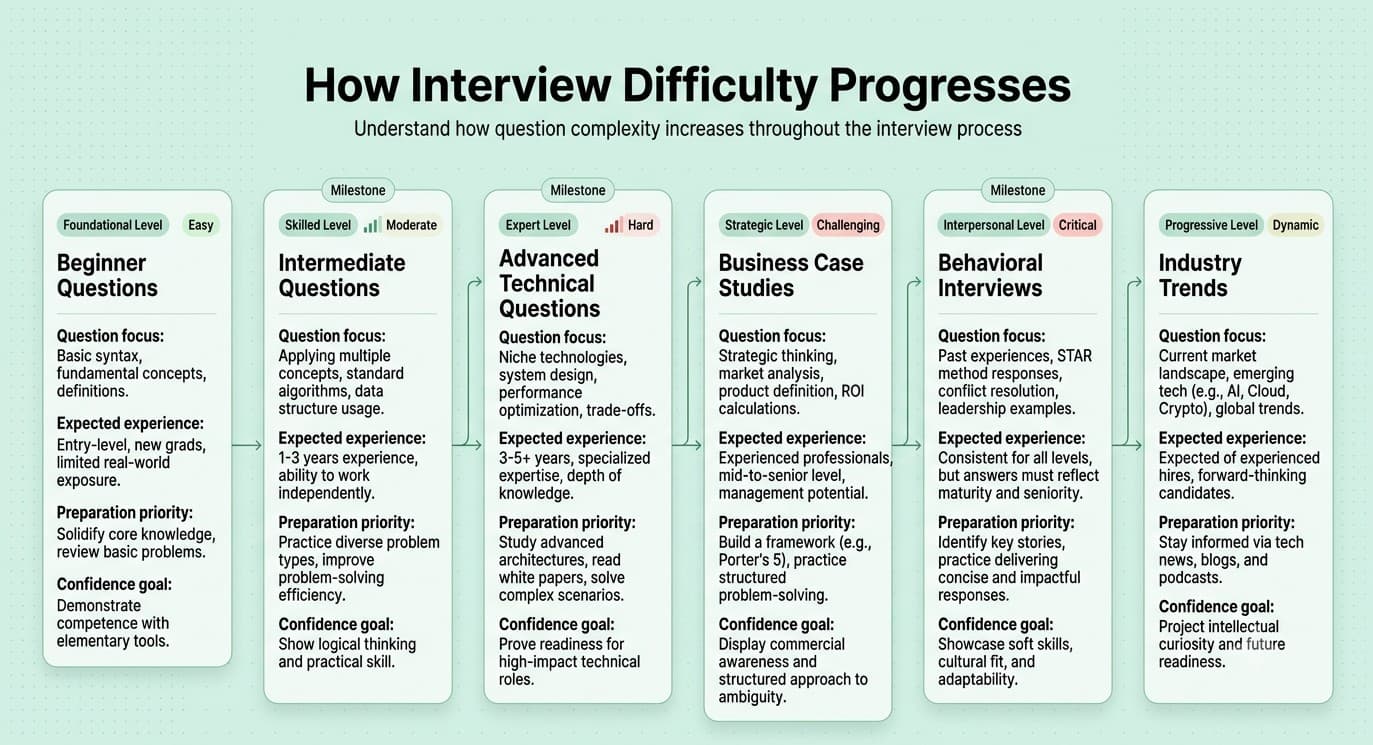
Part 10: Recent Industry Trends
Question 93
Question: How is generative AI (like ChatGPT, Copilot-style tools) changing the day-to-day work of data analysts?
Answer: AI tools increasingly accelerate routine tasks like writing/debugging SQL and Python code, drafting initial chart/dashboard structures, and summarizing large volumes of text or findings — shifting an analyst's core value toward correctly framing business questions, critically validating AI-generated output for accuracy, and higher-level judgment/communication work that AI can't reliably replace. Analysts increasingly need to know how to effectively prompt and verify these tools rather than treating them as infallible.
Explanation: A highly current trend question testing whether the candidate has genuine hands-on perspective on how AI tools fit into real analyst workflows, rather than either dismissing or blindly hyping them.
Real-World Example: Many analysts now use AI coding assistants to quickly draft a first-pass SQL query for a familiar pattern, then apply their own judgment and domain knowledge to verify correctness and refine edge cases the AI may have missed or gotten wrong.
Common Mistakes: Either claiming no familiarity with these tools at all in a technical field where they're increasingly standard, or describing blind trust in AI-generated output without any critical validation step.
Follow-up Questions: How do you validate that AI-generated SQL/code is actually correct before relying on it? What are the risks of over-relying on AI tools for analysis, especially around data privacy or hallucinated results? How do you think analyst skill requirements will shift as these tools improve?
Question 94
Question: What is the modern data stack, and how does it differ from traditional BI/data warehousing approaches?
Answer: The modern data stack typically refers to a set of cloud-native, modular tools working together: a cloud data warehouse (like Snowflake or BigQuery) as the central store, ELT tools to load raw data in before transforming it (rather than the older ETL approach of transforming before loading), a transformation layer (commonly dbt) to model data using version-controlled SQL, and a BI/visualization layer on top — emphasizing modularity, cloud scalability, and treating data transformation with software engineering best practices (version control, testing).
Explanation: Tests awareness of the evolving data infrastructure landscape that shapes how modern analysts actually work, increasingly relevant as more companies adopt these tools.
Real-World Example: A modern analytics engineer/analyst workflow might use dbt to define and test data transformation logic in version-controlled SQL files, with automatic documentation and lineage generation, replacing older, harder-to-maintain, manually-scheduled transformation scripts.
Common Mistakes: Being unfamiliar with ELT versus ETL distinction, or not being able to name or explain any of the commonly used modern tools relevant to the role being interviewed for.
Follow-up Questions: What's the difference between ETL and ELT, and why has ELT become more common with cloud data warehouses? Have you used dbt or a similar transformation tool — what was your experience? How does version-controlling data transformation logic improve reliability compared to older approaches?
Question 95
Question: What is the "analytics engineer" role, and how does it relate to (and differ from) a traditional data analyst?
Answer: Analytics engineering sits between data engineering and data analysis, focusing on building and maintaining well-tested, documented, version-controlled data transformation pipelines (often using tools like dbt) that turn raw data into clean, reliable, analysis-ready models — while traditional data analysts focus more on the downstream consumption of that modeled data to answer business questions, build reports, and generate insights.
Explanation: Tests awareness of an increasingly common, distinct role in the data organization, relevant for understanding team structure and where a candidate's specific skills and interests fit.
Real-World Example: An analytics engineer might build and maintain a well-tested dbt model defining "active customer" consistently for the whole organization, which multiple data analysts across different teams then rely on for their own downstream, business-specific analyses without each needing to redefine the logic themselves.
Common Mistakes: Treating these roles as entirely interchangeable without recognizing the distinct skill emphasis (data engineering/software practices versus business-facing analysis and communication).
Follow-up Questions: Which parts of this analytics engineering skill set do you have experience with, and which are you less familiar with? How do you see these two roles collaborating effectively within a data team? Which of these two role emphases better fits your own career interests, and why?
Question 96
Question: How is the growing emphasis on data governance and privacy regulation (like GDPR, CCPA) affecting the data analyst role?
Answer: Analysts increasingly need to be aware of what data can be used for what purposes, understand data classification/sensitivity levels, work within governed access controls (rather than having unrestricted access to all raw data), and consider privacy-preserving techniques (like aggregation or anonymization) when analyzing or sharing potentially sensitive data — governance is increasingly a shared organizational responsibility rather than something handled entirely by a separate legal/compliance team.
Explanation: Tests awareness of an increasingly important compliance and ethical dimension of the role, especially relevant for analysts working with customer or other sensitive data.
Real-World Example: An analyst building a customer segmentation report might need to ensure the underlying data usage is appropriately consented to and that outputs shared broadly are aggregated to a level that doesn't risk re-identifying individual customers.
Common Mistakes: Treating data privacy/governance as entirely someone else's concern (legal or compliance) rather than something an analyst working directly with the data has real day-to-day responsibility for.
Follow-up Questions: Have you worked in an environment with formal data governance/access controls — what was that experience like? How would you handle a request for an analysis that seems to push against appropriate data privacy boundaries? What's the difference between data anonymization and pseudonymization, and why does that distinction matter?
Question 97
Question: How has self-service BI (where business users build their own reports/dashboards) changed the data analyst's role?
Answer: Self-service BI has shifted much of an analyst's focus away from producing routine, repetitive one-off reports (increasingly handled directly by business users) toward higher-value work: building well-governed, trustworthy underlying data models and metric definitions that self-service tools rely on, handling more complex/ad hoc analytical questions self-service tools can't answer, and supporting/training business users to use self-service tools effectively and correctly.
Explanation: Tests awareness of how the analyst role has evolved as BI tools have become more accessible directly to non-technical business users, an important trend shaping how the role is defined at many companies today.
Real-World Example: Rather than an analyst manually pulling a weekly sales report for a sales manager, a self-service dashboard connected to a well-governed data model might let the sales manager explore that data themselves on demand, freeing the analyst to focus on a deeper, more strategic analysis of what's driving regional sales performance differences.
Common Mistakes: Viewing self-service BI as a threat to the analyst role's relevance, rather than recognizing it as an opportunity to shift focus toward higher-value analytical work.
Follow-up Questions: How would you balance empowering self-service exploration against maintaining data governance and preventing metric definition drift? What would you do if you noticed business users consistently misinterpreting a self-service dashboard? How does this trend change what skills are most valuable for an analyst to develop?
Question 98
Question: What is the growing role of real-time or streaming analytics, and how does it differ from traditional batch reporting?
Answer: Traditional batch reporting processes and refreshes data on a scheduled interval (e.g., nightly), which is sufficient for most standard business reporting, while real-time/streaming analytics processes data continuously as events occur, enabling immediate visibility and action for time-sensitive use cases — at the cost of significantly more complex infrastructure and analytical considerations (like handling late-arriving or out-of-order data).
Explanation: Tests awareness of an increasingly relevant infrastructure trend for certain use cases (fraud detection, operational monitoring), while also testing judgment about when the added complexity of real-time analytics is actually justified versus unnecessary.
Real-World Example: A fraud detection system genuinely benefits from real-time analytics to flag and block suspicious transactions within seconds, while a monthly executive revenue summary has no meaningful need for real-time infrastructure and would be needlessly complex to build that way.
Common Mistakes: Assuming real-time analytics is a strictly superior upgrade to batch reporting for all use cases, without recognizing the added complexity and cost isn't justified unless the specific use case genuinely requires immediate action on fresh data.
Follow-up Questions: What business use cases have you encountered (or can you imagine) that would genuinely justify the added complexity of real-time analytics? What unique challenges does streaming data introduce compared to batch data (e.g., late-arriving events)? How would you decide whether a new reporting request needs real-time infrastructure or can be handled with standard batch processing?
Question 99
Question: How is the increasing availability of embedded analytics (data visualizations built directly into products/apps, not just internal dashboards) changing the analyst's scope of work?
Answer: Embedded analytics involves building customer-facing (not just internal) data visualizations directly within a product, requiring analysts to think about additional considerations beyond internal reporting: performance at scale across potentially many customers simultaneously, careful data security/isolation (each customer seeing only their own data), and design/UX considerations suited to an external customer audience rather than internal stakeholders.
Explanation: Tests awareness of an expanding application area for analytics skills beyond traditional internal-facing dashboards, increasingly relevant as more products incorporate data visualization as a customer-facing feature.
Real-World Example: A SaaS product's customer-facing usage dashboard (showing each customer their own account analytics) requires very different performance, security, and design considerations than an internal company-wide sales dashboard used only by employees.
Common Mistakes: Assuming skills and best practices from building internal dashboards directly transfer without modification to building customer-facing embedded analytics, missing important differences in security, scale, and design requirements.
Follow-up Questions: What data security/isolation considerations become especially important for customer-facing embedded analytics? Have you worked on any customer-facing (versus purely internal) data products — what was different about that experience? How would you approach gathering requirements for an embedded analytics feature differently than for an internal dashboard?
Question 100
Question: How do you personally stay current with evolving tools, techniques, and best practices in the data analytics field?
Answer: A strong answer describes a concrete, ongoing approach: following relevant industry blogs/newsletters, participating in communities (forums, local meetups, online communities), hands-on experimentation with new tools on side projects, and periodically reassessing whether current tools/approaches are still the best fit as the field evolves — showing genuine ongoing engagement rather than a one-time answer.
Explanation: A common closing question testing genuine intellectual curiosity and professional growth mindset, important in a field that continues to evolve quickly.
Real-World Example: A candidate might describe regularly reading specific data-focused newsletters or blogs, experimenting with a new tool (like a new BI feature or a Python library) on a personal project before proposing it for use at work, ensuring genuine hands-on familiarity rather than only surface-level awareness.
Common Mistakes: Giving a vague, generic answer ("I just keep up with things") without any specific, concrete examples of resources, communities, or recent things learned.
Follow-up Questions: What's a specific new tool or technique you've learned about recently, and how did you evaluate whether it was actually worth adopting? Can you name a few specific resources (blogs, communities, newsletters) you follow regularly? How do you decide which emerging trends are worth investing time in learning versus which are likely to be short-lived hype?
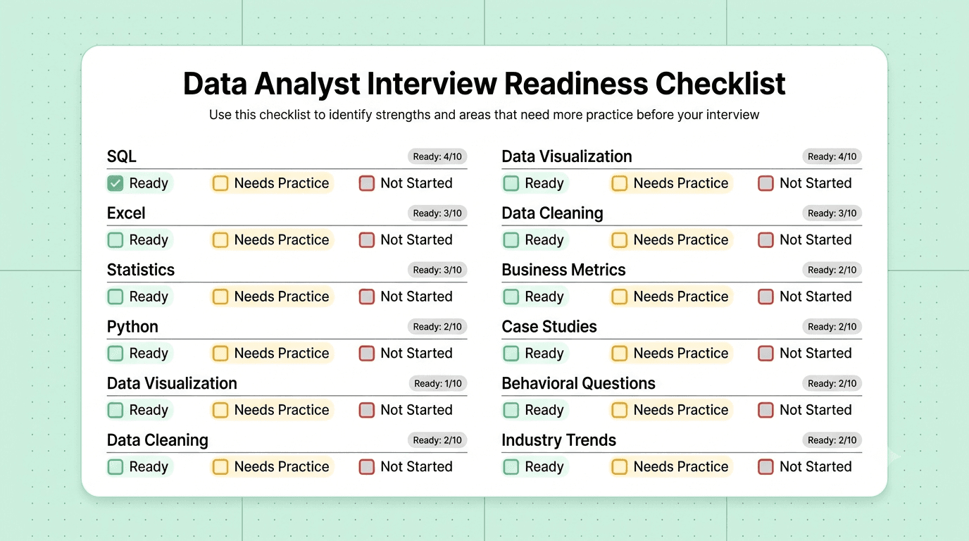
How to Use This Guide
- Don't memorize word-for-word. Use the "Explanation" sections to build genuine understanding, then practice explaining answers in your own words out loud.
- Prioritize by role emphasis. If the role leans heavily analytical/technical, weight Parts 1, 3, 5, and 7 more heavily. If it's a more business-facing or stakeholder-heavy role, spend extra time on Parts 8 and 9.
- Practice the SQL and Python questions hands-on. Reading Parts 1 and 5 isn't enough — actually write and run queries/code against a sample dataset, including edge cases, ideally under mild time pressure to simulate a live technical screen.
- Prepare your own stories for Part 9. Behavioral questions reward specificity — prepare 5-6 real stories from your experience that can flexibly answer multiple questions in this section, since most behavioral questions are variations on a smaller set of underlying themes.
- Practice structuring case studies out loud. For Part 8's business case questions, practice thinking through the structure (clarify, hypothesize, investigate, recommend) verbally, since interviewers evaluate your process as much as your final answer.
- Use follow-up questions as a self-check. After answering a question, try answering its follow-ups too — this is usually where interviews go deeper and where candidates get caught unprepared.