Loading...
Contents
Common Frontend Developer Interview Mistakes to Avoid in 2026
Aug 22, 202642 min readUpdated Oct 6, 2026
The most common frontend developer interview mistakes in 2026 are fixing a CSS specificity conflict with !important instead of understanding the cascade, using TypeScript any to silence errors rather than understanding and fixing them, applying useMemo and useCallback everywhere without being able to explain what specific re-render problem they solve, claiming performance expertise without being able to cite a real Lighthouse score from your own work, building interactive components that cannot be navigated with a keyboard, and submitting AI-generated component code without checking whether it is accessible. Every mistake below has a specific, rehearsable fix built around the actual mechanism that causes the failure, not a suggestion to "be more thorough."
Frontend interviews have a trap that no other engineering interview quite shares: the UI looks right, so candidates assume it is right. A modal opens and closes smoothly, a form submits without errors, a list renders perfectly on every screen size, and the candidate feels confident because everything they can see is working. The interviewer then asks the candidate to navigate the modal with a keyboard, or opens Chrome DevTools and runs a Lighthouse audit, or asks why a specific CSS rule is not applying, and the confidence evaporates.
Most frontend interview failures are not caused by candidates who cannot code. They are caused by candidates who built a mental model of the frontend job that ends at "the UI works visually," when the professional standard includes performance, accessibility, semantic correctness, type safety, and the ability to explain every architectural decision under follow-up questioning. This guide names thirteen specific mistakes, explains why each one costs an offer, and gives a fix specific enough to practice before your next interview.
FREE TO USE
25K+ INTERVIEWS4.8★ RATING68% IMPROVEMENT
Crack Your Dream Job
Real Interviews. Real Pressure. Practice until it feels easy.
- Seamless Interview Experience
- Resume & JD Questions
- Instant Personalized Feedback
Why Frontend Developer Interviews Expose More Gaps Than Candidates Expect
Frontend interviewing is the discipline where the most commonly used evaluation criterion, does the UI work, is also the least predictive of professional quality. Experienced frontend interviewers know this, which is why their questions go specifically to the places visual testing misses: cascade mechanics, accessibility behavior, performance measurement, rendering architecture, and type system understanding.
Every frontend developer can produce a UI that looks correct to a casual observer. The skills that matter in a professional context are the ones that ensure the UI works for someone who cannot use a mouse, loads fast enough on a real mobile connection, stays maintainable when three developers are touching the same component six months later, and does not fall apart when requirements change. Every mistake below is a specific gap between "looks right" and "is right" that experienced interviewers probe for deliberately.
Category 1: CSS and HTML Fundamentals Mistakes
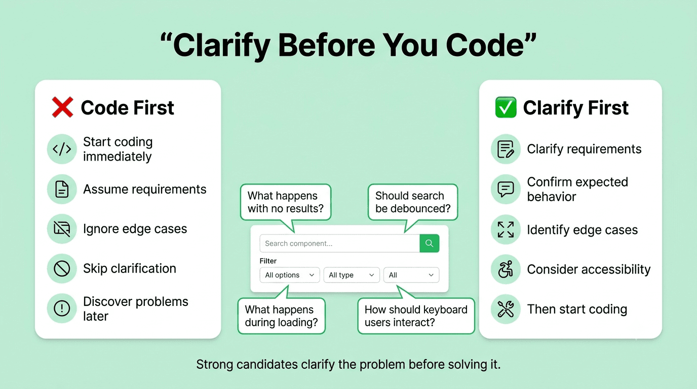
Mistake 1: Solving a Specificity Conflict With !important Instead of Understanding the Cascade
What This Looks Like
A candidate is given a debugging exercise where a CSS rule is not applying as expected. After inspecting the element in DevTools and seeing that another rule is overriding it, they add !important to the non-applying rule, confirm that it now applies visually, and present this as the fix. When the interviewer asks why the original conflict occurred and whether there is a better resolution, the candidate cannot explain the specificity calculation or the cascade ordering that caused the problem.
Why Recruiters Flag This
!important is one of the clearest signals available in a CSS debugging exercise that a candidate is treating symptoms rather than causes. Every experienced frontend developer has inherited a codebase where !important was used as a quick fix repeatedly, creating specificity arms races where the only way to override a rule is to add yet another !important, until nothing is predictable and the cascade is effectively broken. Recruiters treat this choice as a preview of the kind of code the candidate would produce under deadline pressure on a real codebase.
The Real Cost
On the job, a single !important fix is usually not catastrophic. A pattern of them, which is what happens when a developer does not understand the cascade, creates a CSS codebase that becomes progressively harder for anyone to maintain, where every new style addition requires checking whether something else will override it unpredictably.
The Complete Fix
Build a clear mental model of how CSS specificity is calculated, because the calculation is simple and knowing it turns every specificity conflict into a solvable diagnosis rather than a mystery. Inline styles beat ID selectors, which beat class selectors and attribute selectors, which beat element type selectors, which beat inherited values. When two rules of equal specificity apply, the rule that appears later in source order wins. And rules from later stylesheets override rules from earlier ones at equal specificity.
With this model, any specificity conflict becomes a specific question: which rule has higher specificity, and is the answer to lower the overriding rule's specificity or raise the targeted rule's specificity to match it? The correct answer is almost never to add !important, because that breaks the cascade for every future rule that needs to override this one.
In a debugging exercise specifically, narrate the diagnosis out loud before proposing any fix: "The element selector has lower specificity than the class selector in the other rule, so this rule loses. I can fix this by restructuring the selector to match the specificity level it needs, or by addressing whether these two rules should even be competing for the same element." This narration demonstrates the cascade understanding that !important reveals the absence of.
Practice Method
Open the Chrome DevTools Styles panel on any webpage that has competing CSS rules and spend fifteen minutes reading the strikethrough rules, the specificity indicators, and the cascade ordering for five different elements. For each conflict you find, calculate the specificity of both rules by hand and verify your calculation matches what DevTools shows. This exercise builds the diagnostic instinct faster than any tutorial.
Mistake 2: Writing Divs for Everything and Having No Answer When Accessibility Is Raised
What This Looks Like
A candidate's take-home project or live coding submission contains a navigation built with divs and click handlers, a form with labels connected to inputs by visual proximity rather than for attributes, a "button" that is actually a styled div with an onClick, and a set of "tabs" with no ARIA roles or keyboard support. When the interviewer raises accessibility, the candidate either becomes defensive, says they "would add ARIA later," or proposes adding ARIA attributes to the existing divs rather than replacing them with the appropriate semantic elements.
Why Recruiters Flag This
Using the wrong HTML element is not a style choice. It is a correctness error that creates accessibility failures, keyboard navigation breakdowns, and screen reader usability problems in every case. The "I would add ARIA later" response specifically tells an interviewer that the candidate thinks ARIA is a layer you apply on top of working HTML rather than a tool for the narrow set of UI patterns that native HTML cannot express. And the proposal to add role="button" to a div rather than using a button reveals that the candidate does not understand what they get for free from the native element.
The Real Cost
A button element is focusable by default, activated by both Enter and Space keys, announced as "button" to screen readers with no additional markup, and correctly excluded from the tab order when disabled. A div with role="button" requires the developer to implement every one of these behaviors manually and correctly, which almost no one does completely. Every behavior that is missed is an accessibility failure that real users experience.
The Complete Fix
Memorize the mapping from UI pattern to the correct HTML element before any interview, because most UI patterns have a native element that already does everything needed. Clickable elements that trigger an action use button. Clickable elements that navigate to a new URL use anchor with an href. Groups of related form fields use fieldset with legend. Tabbed interfaces use a button for each tab trigger with role="tab" and aria-selected. Navigation landmarks use nav. Main page content uses main. A sidebar uses aside. The rule is: reach for a semantic element first, and only add ARIA when no semantic element exists for the UI pattern you are implementing.
In an interview coding session, say this reasoning out loud: "I'm using a button element here rather than a div because it gives me keyboard activation, focus management, and screen reader semantics without any additional code." This narration turns a basic correct choice into a visible demonstration of accessibility thinking.
Practice Method
Audit any project you have built by opening it and navigating every interactive element using only the Tab and Enter keys, with no mouse. Every element you cannot reach or activate is implemented with the wrong element or missing keyboard support. Fix every issue you find, writing down which HTML element replacement or which keyboard handler resolved each one.
Mistake 3: Claiming Modern CSS Knowledge but Being Unable to Explain What a Container Query Does Differently From a Media Query
What This Looks Like
A candidate lists "CSS Grid, Flexbox, container queries" or "modern CSS" on their resume or describes themselves as strong in CSS during an HR round. The technical interviewer asks them to explain what problem container queries solve that media queries cannot, and the candidate either cannot answer at all, or describes container queries as "like media queries but better" without explaining the fundamental difference in what they respond to.
Why Recruiters Flag This
This question is a direct test of whether the candidate actually uses modern CSS features in their work or lists them after reading a blog post. The distinction between container queries and media queries is not a trivia question: it reveals whether a candidate understands that media queries respond to the viewport width, which is a global condition, while container queries respond to a specific container's width, which is a local condition that makes components genuinely portable across different layout contexts. Missing this distinction means missing the entire point of container queries and therefore not actually knowing when to reach for them.
The Real Cost
A candidate who lists container queries without understanding them will either never use them on the job, defaulting to media query patterns that create layout problems when components are placed in unexpected contexts, or will use them incorrectly, creating styles that behave unpredictably because the containment context was not set up correctly on the parent element.
The Complete Fix
Understand the mechanism first, then the use case. A media query responds to the viewport width, meaning a component styled with media queries changes its layout when the browser window crosses a threshold regardless of where in the page the component is placed. A container query responds to the width of the nearest ancestor that has been declared a container using the container-type CSS property, meaning the same component can have a compact layout when placed in a narrow sidebar and an expanded layout when placed in a wide main content area, without any change to the component's own CSS or the page's CSS.
The use case that makes this concrete: a card component used in both a three-column grid and a full-width sidebar. Media queries make this impossible to style correctly for both contexts without wrapping the card in different parent elements that the media query targets. Container queries make it trivial because each placement context's width becomes the trigger for the component's internal layout change.
Practice building a real component that demonstrates this: the same card component placed in two containers of different widths on the same page, using a container query to switch its internal layout at a specific container width. Being able to describe and demonstrate this specific use case is the answer that tells an interviewer you have actually used the feature, not just read its name.
Practice Method
Build one responsive component using only container queries and no viewport media queries for its internal layout. Place it in three different layout contexts on the same page: a narrow sidebar, a medium-width panel, and a full-width section. Verify that the component adapts to each context correctly without any changes to its usage in those different contexts
Category 2: JavaScript and TypeScript Mistakes
Mistake 4: Using TypeScript any Throughout a Component to Silence Type Errors
What This Looks Like
A candidate submits a take-home project or opens their GitHub portfolio in an interview. The interviewer scrolls through the TypeScript files and finds that API response types are annotated as any, complex prop types are any, and the return type of several functions is inferred as any because the function accepts any. The candidate, when asked about it, explains that they were focused on getting the functionality working and would clean up the types later.
Why Recruiters Flag This
TypeScript any is not a rough draft. It is a deliberate instruction to the TypeScript compiler to disable all type checking for that value, eliminating every benefit that TypeScript provides for that code path. A component whose props are typed as any is identical to an untyped JavaScript component from the compiler's perspective. Reviewers treat widespread any usage as a signal that the candidate does not understand TypeScript well enough to write accurate types, and chose to opt out of type checking rather than learn how to express the types correctly.
The Real Cost
The TypeScript errors that candidates silence with any are usually the compiler identifying a real uncertainty about the shape of data. Suppressing that uncertainty with any does not resolve it: it hides it until a runtime error surfaces in production when the data shape assumption turns out to be wrong.
The Complete Fix
The fix for most cases where any is tempting has a specific alternative. For an API response of unknown shape, use unknown and narrow the type with a type guard before using the value. For a value that could be one of several known types, use a union type. For a function that needs to work with multiple different input types, use generics. For an existing library type that is incomplete, use a module augmentation to extend it rather than casting to any.
Practice the specific alternative for each any-tempting scenario. The most common one in component code is an API response that has not been typed yet. Instead of typing the response as any, define an interface that matches the expected shape, use that interface as the return type of the fetch function, and let the compiler verify every property access against that interface. If the API response shape is genuinely unknown at compile time, use unknown and write a type guard function that narrows it to the expected interface before use.
In a portfolio review, being able to say "I don't use any in this project, and here is how I handled the API response types" is a stronger statement than any amount of TypeScript version number dropping.
Practice Method
Run TypeScript's compiler on a project you have already written with --strict --noImplicitAny flags enabled and resolve every error without using any as the fix. For each error, research the correct TypeScript pattern for the specific situation: union types, generics, type guards, or interface extension. This session will surface every gap in your TypeScript type vocabulary and fill them with real patterns.
Mistake 5: Writing a useEffect With an Incorrect Dependency Array and Not Being Able to Explain the Consequences
What This Looks Like
A candidate writes a useEffect in a live coding round or a take-home, and either leaves the dependency array empty when the effect uses values from the component scope, adds every value to the dependency array without understanding which values are stable references versus new objects on every render, or omits the dependency array entirely. When asked what happens in each of these cases and why, the candidate cannot explain the behavior at the mechanism level.
Why Recruiters Flag This
This is one of the most common sources of real production bugs in React codebases: stale closures that produce incorrect behavior, infinite re-render loops caused by non-stable object references in dependency arrays, and effects that run more or less frequently than intended. Interviewers probe this specifically because the dependency array is an area where wrong code often looks right, passing visual inspection and basic testing while failing subtly under specific conditions.
The Real Cost
A stale closure in a useEffect can cause a component to use an outdated value for state or props in its effect logic, producing incorrect behavior that is intermittent and difficult to reproduce reliably. An infinite loop from a dependency array that includes a new object reference on every render causes a component to re-render continuously, degrading performance for every user until the bug is found and fixed.
The Complete Fix
Internalize the mechanism of the dependency array rather than memorizing rules about it. React runs a useEffect after every render where any value in the dependency array changed since the last time the effect ran. The comparison uses Object.is, which is reference equality for objects and arrays. This means a new object literal created inside the component body, even with the same property values as the previous render, will always be a different reference, always trigger the effect, and if the effect updates state, will cause an infinite loop.
The practical implication is a two-step check for every useEffect: first, does the dependency array include every value from the component scope that the effect uses, so the effect always has access to current values? Second, are any of those dependencies new object references on every render, and if so, should they be stabilized with useMemo or useCallback, or should the effect be restructured to not depend on them?
In an interview, narrate this reasoning when writing any useEffect: "I'm using the user.id value in this effect, so it goes in the dependency array. The options object I defined inside the component would be a new reference on every render, so I'll either move it outside the component or wrap it in useMemo to make the reference stable." This narration tells the interviewer you understand the mechanism, not just the syntax.
Practice Method
Find a React component you have already built that uses useEffect and deliberately introduce each of the three failure modes: remove a dependency that is used in the effect, add a new object literal to the dependency array, and remove the dependency array entirely. Observe the behavior in each case, explain it based on the mechanism, and restore the correct version.
Category 3: React-Specific Mistakes
Mistake 6: Adding useMemo and useCallback Everywhere Without Being Able to Name the Specific Re-render Problem They Solve
What This Looks Like
A candidate's component code uses useMemo on every computed value and useCallback on every function defined inside a component, including simple functions that are not passed as props to child components. When the interviewer asks "which specific re-render problem does this useMemo solve," the candidate gives a general answer about preventing unnecessary re-renders without being able to point to a specific component, a specific prop, and a specific re-render behavior that the memoization addresses.
Why Recruiters Flag This
useMemo and useCallback carry a real cost: they require React to maintain a cache of the previous value and compare dependencies on every render. When applied to a value that changes on most renders anyway, or to a function that is not passed to a memoized child component, they add overhead without providing any benefit. Candidates who apply them reflexively everywhere reveal that they learned "memoize everything" as a performance rule rather than understanding the specific situations where memoization provides a measurable benefit.
The Real Cost
A codebase full of reflexive memoization is harder to read, harder to maintain, and carries real overhead for every dependency comparison on every render. More importantly, a developer who memoizes everything has not actually solved any specific performance problem: they have added complexity while leaving the real problem unidentified.
The Complete Fix
Internalize the two specific situations where memoization is justified, and apply it only in those situations. useMemo is justified when a computed value is genuinely expensive to calculate, meaning it involves substantial work, not a simple addition or array lookup, and the component re-renders frequently due to its parent's state or context changes. useCallback is justified when a function is passed as a prop to a child component that is wrapped in React.memo, because without useCallback the function reference changes on every render and React.memo's comparison fails, defeating the optimization.
In both cases, the correct order of operations is: identify a specific performance problem using the React DevTools Profiler, confirm the root cause, and then apply the appropriate memoization as a targeted fix. Applying memoization without profiling first is writing code without understanding what problem it solves, which is exactly what this question is designed to reveal.
In an interview, if you reach for useMemo or useCallback, say why before writing it: "I am wrapping this function in useCallback specifically because it will be passed to the RowComponent below, which I am wrapping in React.memo to prevent unnecessary re-renders when the parent table state updates." This narration is the thing that separates a candidate who understands performance optimization from one who applies it decoratively.
Practice Method
Take a component you have already built that uses useMemo or useCallback and remove every instance of it. Run the component in the React DevTools Profiler. Add memoization back only where the profiler shows a specific re-render that occurs without it and does not occur with it. Count how many of your original memoizations were justified by this test.
Mistake 7: Treating Every Next.js Component as a Client Component Without Understanding the Server Component Model
What This Looks Like
A candidate's Next.js App Router project has "use client" at the top of almost every component file, including components that do no interactivity, use no hooks, and make no browser API calls. When asked why a specific component is marked as a client component, the candidate either cannot give a specific reason or says they marked everything as a client component to avoid errors, which is the exact behavior that defeats the primary benefit of the App Router's server component architecture.
Why Recruiters Flag This
Adding "use client" to every component is the Next.js App Router equivalent of using any for every TypeScript type: it compiles, it runs, and it signals a complete misunderstanding of the feature being used. Server components are the App Router's most significant performance mechanism, reducing JavaScript bundle size by keeping non-interactive components out of the client bundle entirely. A project where every component is a client component is a project that gained none of these benefits while adopting the framework's added complexity.
The Real Cost
A Next.js App Router project where every component is a client component ships more JavaScript to the browser than an equivalent pages router project would, because it adds the server component infrastructure cost without any of the bundle reduction benefit. This directly worsens Core Web Vitals metrics for no reason.
The Complete Fix
Build a clear mental model of the boundary between server and client components: a component needs "use client" only if it uses React hooks, handles browser events with onClick or onChange handlers, uses browser-only APIs such as window or document, or relies on state or context that updates based on user interaction. A component that only receives props, renders JSX based on those props, and possibly fetches data directly from a database or server is a server component by default, and should remain one.
The practical approach in any Next.js project is to start every component as a server component, no "use client" directive, and only add it when the compiler or runtime tells you a specific hook or browser API requires it. Then push "use client" as low in the component tree as possible, so only the truly interactive leaf components become client components while their non-interactive parents remain server components.
In an interview, when discussing a Next.js project, be able to explain every component that has "use client" with a specific reason: "this component needs "use client" because it uses useState to manage the expanded state of the accordion" rather than "everything has it because that's how I set it up."
Practice Method
Go through a Next.js App Router project you have built and remove "use client" from every component. Fix only the errors the compiler raises, and note the specific reason each component needs it. At the end, document how many components genuinely need to be client components versus how many were marked that way unnecessarily.
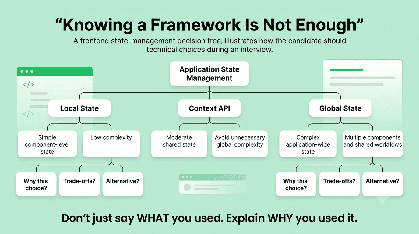
Mistake 8: Being Unable to Explain Where State Lives in Their Own Project and Why
What This Looks Like
Asked to walk through a React project during a portfolio review, a candidate explains features and UI but cannot clearly articulate why certain state is in a specific component, whether there is duplication of state across components, or why they chose a specific state management approach. When the interviewer asks "why is this piece of state in the parent rather than the child," the candidate gives a vague answer rather than explaining the specific reason: that the state needs to be shared with a sibling component, or that it controls a layout behavior visible to the parent, or that it comes from a server fetch that the parent owns.
Why Recruiters Flag This
State placement is one of the most consequential architectural decisions in any React application. State placed too high causes unnecessary re-renders across the component tree. State placed too low gets duplicated or requires prop drilling through many layers to reach where it is needed. State placed in the wrong component causes synchronization problems when two parts of the UI need to reflect the same value. A candidate who cannot explain their own state architecture is either working from a tutorial structure they did not fully understand, or has not reflected enough on their own work to make the kind of deliberate architectural decisions a professional frontend developer makes daily.
The Real Cost
On the job, poor state architecture compounds. Every new feature added to a component with state in the wrong place makes the problem slightly worse, until a codebase becomes genuinely difficult to reason about and bug-prone because state is spread unpredictably and synchronized inconsistently.
The Complete Fix
For every piece of state in any project you would show in an interview, prepare a one-sentence explanation of why it lives where it does, grounded in one of three reasons: the state is private to a single component and does not affect anything outside it, so it lives in that component as local state; the state needs to be shared between a specific set of components, so it has been lifted to their nearest common ancestor; or the state is global enough, or would require too many layers of prop drilling to reach its consumers, that it belongs in a context or a state management store.
If you cannot give a specific reason for a piece of state's location, restructure it until you can. The process of deliberately examining and justifying each state placement decision is what builds the state architecture instinct that interviewers are evaluating.
Practice Method
Draw a component tree for any React project you have built and annotate each node with the state it owns. For every piece of state, write one sentence justifying its placement. Find any state that you cannot justify specifically, restructure it, and verify the behavior did not change.
FREE TO USE
8k+ SESSIONS92% FLUENCY4.9★ RATING
Speak With Confidence
Real Conversations. Real Scenarios. Speak until it feels natural.
- Real-Time Speaking Practice
- Guided Conversation Flows
- Instant AI Feedback
Category 4: Performance and Accessibility Mistakes
Mistake 9: Claiming Performance Skills Without Being Able to Cite a Specific Lighthouse Score From Your Own Work
What This Looks Like
During an HR or technical round, a candidate says they care about performance, lists Core Web Vitals on their resume, or describes themselves as performance-focused. When the interviewer asks "what is the Lighthouse performance score on your portfolio site or your most recent personal project," the candidate does not know the score and has never run a Lighthouse audit on a project they built.
Why Recruiters Flag This
Performance as an abstract value is not a skill. Performance as a specific, measured, and iteratively improved property of real code is a skill. A candidate who lists Core Web Vitals knowledge but has never run a Lighthouse audit on their own work has demonstrated that the knowledge is theoretical, which is exactly not what frontend performance engineering requires. Recruiters who care about performance specifically screen for whether candidates have actually engaged with the measurement tools, because measurement is the entire discipline: you cannot optimize what you have not measured.
The Real Cost
An untested performance claim is particularly damaging in frontend interviews because it is so easy to verify. Any interviewer can ask a candidate to open their portfolio in a browser, open Chrome DevTools, and run a Lighthouse audit live in the interview. A candidate who discovers a score of 45 in that moment, with no context or prepared explanation, is in a worse position than one who never mentioned performance at all.
The Complete Fix
Run Lighthouse on every project you list on your resume or show in a portfolio review, record the scores in the four categories, understand specifically what is causing any score below 90, and apply at least the three highest-impact fixes available for each project. Then be able to cite those numbers and explain the decisions that produced them.
The goal is not a perfect score. The goal is to have engaged with the measurement enough to have a real answer for "what is your score and what does it reflect about your implementation choices." A candidate who says "my portfolio site scores 73 on performance because I have not yet optimized the hero image loading, and I know specifically that fixing the image format and adding a preload link would bring it to around 88 based on the Lighthouse diagnostics" is demonstrating real performance engineering, not just awareness of the concept.
Practice Method
Run Lighthouse on the three projects currently on your resume. Record the scores. For any score below 90, read the specific diagnostics Lighthouse provides and implement the top two fixes. Run Lighthouse again and record the improvement. Prepare a two-sentence explanation of the score and the decisions behind it for each project, because this is a question you can expect in any frontend interview where performance appears on your resume.
Mistake 10: Submitting Interactive Components That Cannot Be Navigated With a Keyboard
What This Looks Like
A candidate submits a take-home with a custom dropdown menu, a tabbed interface, a modal dialog, or an autocomplete input. These components are built with click handlers on div elements or non-standard elements. The interviewer opens the submission in a browser and presses Tab to navigate to the component, then presses Enter or Space to interact with it, then uses arrow keys to navigate within it. Nothing works as expected because no keyboard event handlers were implemented.
Why Recruiters Flag This
Keyboard inaccessibility is not a minor polish issue. It is a complete usability failure for every user who navigates by keyboard, including people with motor disabilities who cannot use a mouse, power users who prefer keyboard navigation, and anyone on a touch device using a Bluetooth keyboard. Companies facing accessibility compliance requirements cannot ship keyboard-inaccessible components, which means a developer who produces them creates real liability.
The Real Cost
Every interactive component that is mouse-only requires a complete reimplementation to add keyboard support, because keyboard support is not something that can be added as a thin layer on top of a component designed purely for mouse interaction. It requires rethinking the focus management, the event model, and often the HTML structure, all of which is significantly harder after the fact than building it correctly from the start.
The Complete Fix
Build a keyboard interaction model into your mental prototype of every interactive component before writing a single line of code, because retrofitting it is far harder than starting with it. For any component that users interact with, answer four questions before implementing: which element receives focus when the user tabs to this component? How does the user activate the primary action using only the keyboard? How does the user navigate within the component if it has multiple selectable options? How does the user escape or close the component and where does focus go when they do?
For the most common interactive patterns, the keyboard model is standardized in the ARIA Authoring Practices Guide, which documents the expected keyboard interaction for every major UI pattern including dialogs, menus, tabs, listboxes, and comboboxes. Read the keyboard interaction section for any pattern you are implementing before writing the component, and implement it exactly as specified.
Practice Method
Take the interactive components from your most recent take-home or personal project and navigate each one using only the Tab, Enter, Space, Escape, and arrow keys. Document every keyboard interaction that does not work, implement the correct keyboard behavior for each, and test again. Commit to never submitting a take-home without this keyboard test as the final review step before submission.
Mistake 11: Adding ARIA Attributes Incorrectly or to Elements That Already Have the Right Semantics
What This Looks Like
Two different versions of this mistake appear in interviews. In the first, a candidate adds role="button" to a div with an onClick handler rather than using a button element, then adds tabindex="0" to make it focusable and a keydown handler to handle Enter key activation, but forgets Space key activation, because the native button element handles both for free. In the second, a candidate adds role="navigation" to a nav element, or aria-label="heading" to an h2 element, adding ARIA attributes to elements that already have those semantics built into the HTML element itself.
Why Recruiters Flag This
Both mistakes reveal a fundamental misunderstanding of the relationship between HTML semantics and ARIA. Native HTML elements carry their own implicit ARIA role, their own keyboard behavior, and their own screen reader semantics without any additional markup. Overriding these with explicit ARIA, especially incorrectly, can create a worse experience than the native element provides, because ARIA changes what screen readers announce without changing the underlying browser behavior.
The Real Cost
A div with role="button" that is missing the Space key handler is an accessibility failure for any user who relies on that standard keyboard behavior. A nav element with role="navigation" added explicitly is not harmful but reveals to a reviewer that the developer does not understand that nav already has that role implicitly, which raises questions about what else they may have gotten wrong.
The Complete Fix
Memorize the first rule of ARIA: if you can use a native HTML element or attribute with the semantics and behavior you require, use it instead of adding a role and making the element accessible through JavaScript. A button is a button. A link is an anchor with an href. A list is a ul or ol. A text input is an input of type text. A radio button group is a fieldset with legend containing inputs of type radio.
ARIA is reserved for UI patterns that have no native HTML equivalent: a tab panel interface, a custom combobox with autocomplete behavior, a tree view, a tooltip. For these patterns, follow the ARIA Authoring Practices Guide exactly, because these patterns require specific combinations of role, aria-selected, aria-expanded, aria-controls, and keyboard interactions that all have to be correct together.
The diagnostic question before adding any ARIA attribute is: is there a native HTML element that already provides this semantic? If yes, use the native element. If no, look up the ARIA specification for this pattern and implement the full interaction model, not just the role.
Practice Method
Audit a past project for every ARIA attribute used. For each one, ask whether the attribute is overriding the native semantics of a native element, and if so, replace the ARIA approach with the native element. For ARIA used correctly on custom patterns, verify the full keyboard interaction model matches the ARIA Authoring Practices Guide specification for that pattern.
Category 5: AI-Era Mistakes Specific to Frontend Interviews
Mistake 12: Submitting an AI-Generated Component That Fails Keyboard Accessibility Without Reviewing It
What This Looks Like
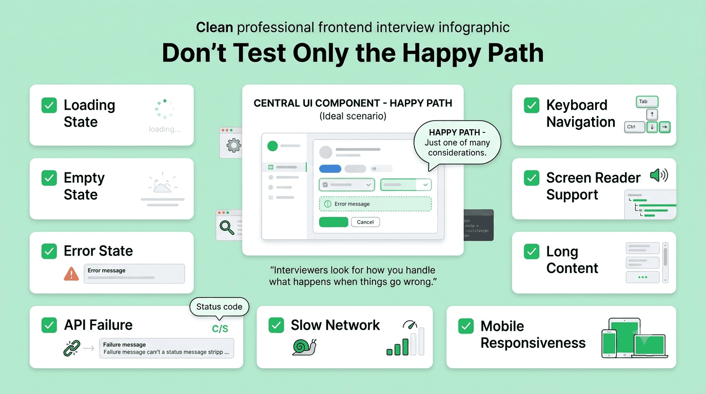
A candidate uses an AI coding tool to generate an interactive component for a take-home assignment. The component works correctly with a mouse, passes every functional test case the candidate manually runs, and looks polished. The candidate submits it. The reviewer opens it, navigates to the component with the Tab key, and discovers that a custom dropdown cannot be opened with Enter, that a modal does not trap focus, that a tooltip does not appear on keyboard focus, or that a carousel control cannot be activated without a mouse.
Why Recruiters Flag This
This mistake is specific to AI-assisted code because it is the exact failure mode AI tools most consistently produce: generating interactive components that look correct visually and behave correctly with a mouse, while silently omitting keyboard interactions and screen reader support. A candidate who submits AI-generated code without a keyboard accessibility check has demonstrated that they either do not know this is a common AI failure mode, or know it and did not care to check. In 2026, with accessibility now a legal requirement in many markets, neither answer is acceptable.
The Real Cost
The candidate loses the offer, but more specifically, they lose it for the worst possible reason: the technical work was fast and visually impressive, and a five-minute keyboard test would have revealed the exact failure that caused the rejection.
The Complete Fix
Make keyboard testing the final, non-negotiable step before submitting any take-home assignment that contains interactive components, regardless of whether those components were AI-generated or self-written. The test takes five minutes and catches the most common class of AI-generated accessibility failures.
Specifically for AI-generated interactive components, apply a frontend-specific review checklist before submission. Can the component be reached by pressing Tab from a previous focusable element? Can its primary action be triggered with Enter? Can its primary action be triggered with Space? Can it be closed or exited with Escape and does focus return to a logical location? Can multi-option components like dropdowns and tabs be navigated with arrow keys? Does anything change visually on keyboard focus that would not change on mouse hover? Run each of these checks on every interactive component before submitting.
Add a note in your take-home's README documenting that you tested keyboard accessibility, and if you found and fixed an issue, describe it. This note demonstrates a review discipline that most candidates do not demonstrate and makes your accessibility awareness visible even when the interviewer does not specifically test it themselves.
Practice Method
Generate five interactive components using an AI coding tool, specifically targeting components known to have complex keyboard interactions: a dropdown menu, a modal dialog, a date picker, a tabbed interface, and an autocomplete input. Navigate each one with only a keyboard immediately after generation, before making any other changes. Document every keyboard failure you find. Use this exercise to calibrate exactly which categories of interactive components AI tools most reliably get wrong.
Mistake 13: Not Catching Semantic HTML and Type Safety Problems in AI-Generated Code During a Live Review Round
What This Looks Like
An interviewer shows a candidate a realistic-looking React component generated by an AI tool and asks them to review it as if it were a pull request. The component has working logic and a reasonable visual structure. The candidate comments on variable naming and suggests a minor refactor, but does not notice that the component uses a div as a button with an onClick handler and no keyboard support, that the TypeScript props interface types three properties as any because the AI could not determine their correct types, and that an image element has an empty alt attribute for an image that is decorative but is placed in a context where it should be described to screen reader users.
Why Recruiters Flag This
Code review rounds involving AI-generated code are specifically designed to test whether a candidate has the judgment to catch the category of problems that AI tools routinely produce. A reviewer who focuses only on logic correctness and misses semantic, accessibility, and type safety failures is not performing a real frontend code review: they are performing a logic check and calling it complete.
The Real Cost
On the job, missing these issues in code review means they ship. Shipped div-based buttons break accessibility for real users. Shipped any types silently remove type safety from the downstream code that consumes the component's props. Shipped empty alt attributes either fail accessibility requirements or incorrectly silence screen readers for content that should be described.
The Complete Fix
Develop a mental review checklist for frontend pull requests that is front-loaded with the categories AI tools most reliably miss, rather than beginning with logic correctness and treating semantics, accessibility, and type safety as afterthoughts.
The checklist in priority order: Is every interactive element implemented with a semantically correct HTML element that provides keyboard support, focus management, and screen reader semantics without ARIA additions? Are all TypeScript prop types accurate and specific, meaning no any, no object without a shape definition, and no Function without a signature? Do all images have an appropriate alt attribute: descriptive text for informative images, empty string for decorative ones, and a meaningful alt value for images that convey information the surrounding text does not? Are all form inputs correctly associated with visible or screen-reader-only labels? Does the component handle its error and loading states accessibly, not just visually?
Running through this checklist on any AI-generated code in a review round takes under two minutes and catches the specific failure categories that separate candidates who understand frontend quality from candidates who only check whether the code runs.
Practice Method
Ask an AI tool to generate ten different React components of varying complexity. Review each one using only the five-category checklist above, writing a specific comment for each issue found. Then assess which categories of issue appeared most frequently across the ten components. Use this frequency data to prioritize which checklist items you lead with in future reviews.
Self-Check: Are You Making These Mistakes Without Realizing It
- When you encounter a CSS specificity conflict, do you calculate the specificity of both rules and restructure them rather than reaching for !important?
- Does every interactive element in your take-home projects use a semantically correct HTML element that provides keyboard support without ARIA additions?
- Can you explain the difference between what a container query responds to and what a media query responds to, with a specific use case for each?
- Does your TypeScript code avoid any for all types where the correct type can be expressed with a union, a generic, or an interface?
- Can you explain the dependency array of every useEffect in your code and describe what would happen if you removed a specific dependency?
- When you use useMemo or useCallback, can you name the specific re-render problem you measured that justified using it?
- Can you explain which components in your Next.js project are server components and which are client components, with a specific reason for each?
- Can you explain where state lives in your React projects and give a one-sentence reason for each placement decision?
- Can you cite the Lighthouse performance score for every project on your resume and explain two decisions that affected it?
- Have you navigated every interactive component in your most recent take-home using only a keyboard and confirmed every interaction works?
- Can you explain every ARIA attribute in your code, and for each one, confirm there was no native HTML element that would have been more appropriate?
- Do you run a keyboard navigation test on every AI-generated interactive component before submitting or merging it?
- Do you lead code review of AI-generated frontend code with checks for semantic HTML, accessibility, and TypeScript type accuracy before logic correctness?
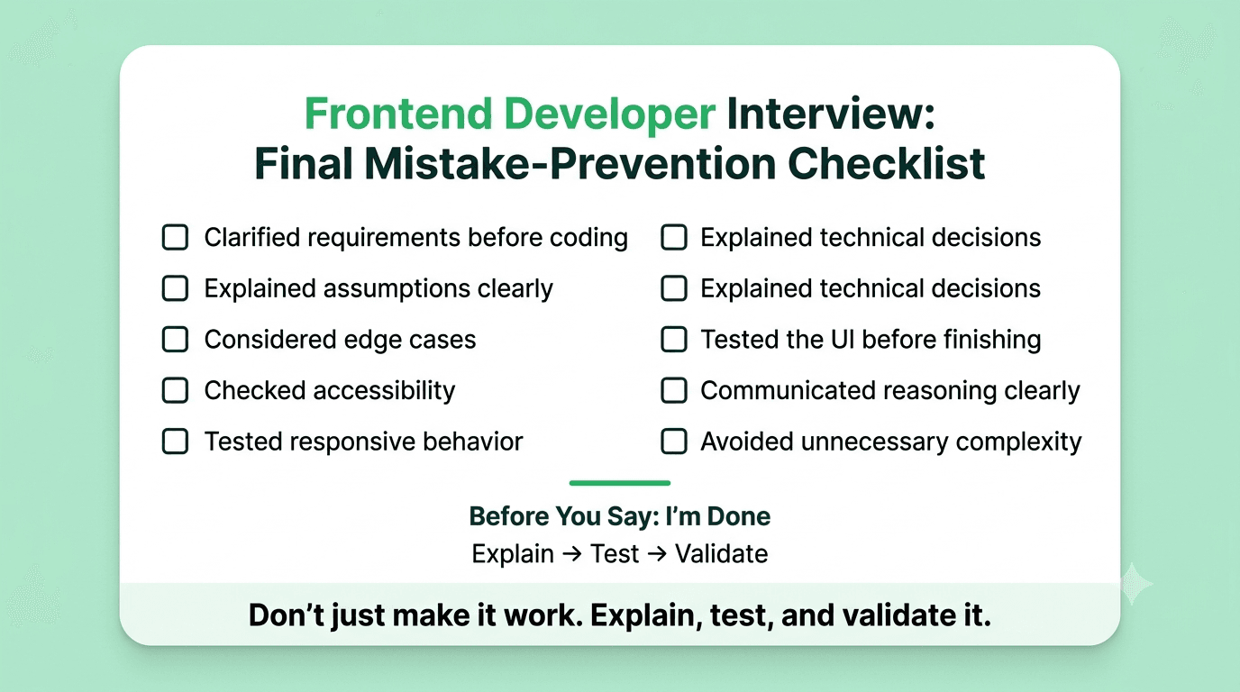
If more than three of these are unchecked, this list is your concrete prep plan for the next two weeks, not supplemental reading.
Read More : Top Frontend Developer Skills Recruiters Look for in 2026
Final Thoughts
Thirteen frontend-specific mistakes, all of them invisible to visual testing and all of them immediately visible to an experienced frontend interviewer who knows where to look. The pattern connecting them is the same one that produces most frontend interview failures: treating "it works for me with my mouse, in my browser, on my screen" as the completion condition for frontend work, when professional frontend development includes correctness for keyboard users, measurable performance, semantic HTML that communicates structure and meaning, and type safety that catches errors before they reach runtime.
The fix for every mistake above is available and rehearsable before your next interview. Keyboard testing takes five minutes. Lighthouse takes two minutes to run. A TypeScript strict mode audit surfaces every any in thirty seconds. What makes these fixes stick under interview pressure is doing them repeatedly until they become the default, not just knowing they exist.
The gap between knowing a fix and applying it automatically when you are writing code under scrutiny in a live round is a real gap, and it is exactly the gap that consistent, pressure-tested practice is designed to close. Structured mock interview practice on a platform like Mocklingo gives you the environment to build these habits under realistic interview conditions, before the stakes are real.
Start Practicing Frontend Developer Interview with Mocklingo